Projects > Redesign - 2021
FitchConnect
redesign - 2021
Along with Moody’s and S&P, Fitch Ratings is one of the “Big Three” credit rating agencies. The content it produces is delivered at great expense to subscribers by Fitch Solutions through FitchConnect, a Web-based “enterprise research platform” conceived and produced by a handful of business and technical people in 2015. None of whom were designers. The result was an all-too common one: Inscrutable workflow and poor retention had become the product’s hallmarks. In 2019, the technical manager and I endeavored to change all that. Together we not only transformed the product, we transformed the organization.
Enterprise Research Platform

The Ask
When your car repeatedly stalls out in traffic, it’s not always clear why. There’s gas in the tank and you’re standing on the accelerator, but the car won’t budge. The product org at Fitch Solutions was similarly stumped in 2019 as to their Web-based research platform, Fitch Connect. Why weren’t clients re-upping their subscriptions? All the warning lights on the “dash” pointed to design. So when I joined, it was time to pop the hood and take a look.
The Challenge
FitchConnect was a mess. It’s user experience was a tangled ball of cognitive overload and inscrutable workflows. To fix this, three interlocking challenges would need to be met in parallel. The first was to radically evolve the design culture. The second was to disabuse powerful stakeholders of the premise upon which the design of FitchConnect was conceived. Meeting these would enable us to meet the third challenge of untangling and improving the UX.
Why were big name clients like JP Morgan Chase not renewing their subscriptions to FitchConnect ?
Where We Started
What FitchConnect was supposed to do
Welcome to the world of financial news!
Did you know an entire shadow world of journalism exists in parallel to the mainstream news you get from outlets like CNN and The New York Times? If you’re like me, news is something you half listen to while eating your bowl of cereal in the morning.
But for high-finance types, news is the lifeblood of their multi-million dollar global investment strategy. So it has to be thorough. And not just Wall Street Journal thorough. We’re talking vetted, researched, corroborated, and highly, HIGHLY detailed thorough. Where can they go to get this kind of information?
Well, generally, Bloomberg. But also FitchConnect. At least this was the theory.
worth the money?
As you might have guessed, access to this kind of critical research was not cheap. Try $70K a year for a subscription!
But in 2019, FitchConnect (FC) was a research platform you needed additional research to use. For reasons I’ll get into, the non-designers who imagined this product seemed to have confused quantity with quality. Complexity with sophistication. And novelty with utility. All errors common to the novice.
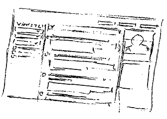
And this junior design decision-making had gotten between users and the valuable information they had paid so much money to access. Believe it or not, the arcane, bifurcated wall of mysterious UI below was intended to facilitate one of the most common user experiences on the Web. So why does it look like it’s used to pilot the space shuttle?
Find something — We dare you
Let’s briefly take a closer look at this one example. What does this page (below) look like to you? What’s it for? The primary navigation, at the top of the page, says you’re in ‘Search.’ But as we scan directly right from that label we see a ‘global search’ field. And what’s all this other stuff in the top half of the page? I myself had to seek out multiple internal stakeholders to answer my most basic questions about this view. Imagine if I’d been a user!


Believe it or not, this page ( above ) had only one purpose, not several. I learned it was intended to enable users to find, consume, and save desirable content. Something any regular user of the Web does every day — whether they’re searching Google or Amazon. So what was getting in the way?
So many, many things. Here’s just six of them:
- Cognitive Load: This page is overwhelming. For enterprise software, there may be occasion to present a lot of complexity. But this was not one of them. Nor was it the right way to do so.
- Wasted Space: Nearly a third of the page "above the fold" is just empty space. In the very part of the page where users are most likely to be looking, they see a bizarre void.
- Confusing Bifurcation: This page seems to be presenting two discrete sections. But the top half very much drives the bottom. The problem was that there was no visual indication of that connection.
- Buried Lede: There is an unacceptable amount of "UI chrome" standing between the user and anything she's actually looking for. All the good stuff has been pushed to the bottom of the page.
- Mixed Messaging: There are five magnifying glass icons on this one page. Two invite you to search. Another two invite you to zoom. Can you find the fifth? What do YOU think THAT one does?
- Scattered Functionality: There are three discrete places on this page where the user can add search criteria and apply filters to get to the content he's looking for. Why separate them?
The whole site was this way
It’s like I come to our home page, and I don’t know what to do next.”
Unfortunately, the above search view was not an isolated case. Not every page on a Web-site can be a dashboard. But whoever had designed key pages in FitchConnect had never gotten that memo. The entire product seemed as if it had been intended to alternately overwhelm and confuse our hapless users.
A person of influence at Fitch said it best when she remarked “It’s like I come to our home page, and I don’t know what to do next.”

Headwinds
Every project has them. The problems over which you have no control. To be successful, designers must discover these and work around them. My allies and I were able to change a great deal at Fitch. But these were the three problems that persisted throughout my tenure:
No access to users
The biggest open secret in industry-specific enterprise software is that actually talking to actual users of the digital products being offered in this space is usually the last thing on anyone’s mind. In the highly secure, highly secretive world of high finance, this was doubly so.
When this door remains shut, product designers must seek out and identify those internal resources who either most closely resemble the target persona, or who most closely work with actual customers. At Fitch I found one of each and validated my design ideas with them.
Remote-only access to the product org
I myself, and the people who actually coded FitchConnect, worked out of office space in downtown Chicago. Everyone who decided what FC needed to do worked out of the Hearst Tower in New York City. In over 2 years, I never once met the Product Manager of FitchConnect in person.
I believe teams working remotely can be successful. I also believe it’s a little bananas to NOT get people who work together in the same physical room every now and then. Covid would change everything mid-project, but I was grateful for the time I’d had in person with the dev team at least.
Product Org preeminence
To appreciate the value of getting people who work together in the same room, one must first admit they are in fact working TOGETHER. This dynamic was more like: there’s the product org, and then there’s everyone who works FOR the product org. We in The Second City were in that second category.
Surprise, surprise, corporate politics exists. You won’t catch me complaining about it. My job was to understand it, and to the degree I could, work around it so everyone could be successful. Much of this, as we shall see, involved protecting the product org in New York from themselves.

Product Team
the team you want :
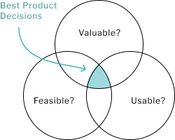
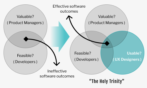
As Product Management thought leader Marty Cagan has written, success in creating or innovating enterprise software depends on solving for three discrete, but interlocking risks. Often referred to as “The Holy Trinity,” they are as follows:
First, is the solution valuable? That is, can we sell it? Second, is the solution feasible? That is, can we build it with the resources we have, and in the time allotted?
And third, is the solution usable? That is, can a reasonably intelligent person sit down in front of this product, understand what it is, how it works, and, if they are the intended persona, start using it with little or no instruction?
Successfuly managing these three risks means making smart decisions about what to build and how to build it. Such decisions are said to be smart when each has been EQUALLY vetted for value, feasibility, and usability.
All such decisions should promote value, but none of the three considerations should otherwise predominate. We all want a perpetual motion machine, but if it can’t be built, it’s time to consider the next most valuable option.
So how does all this theory bear on an empowered product team?
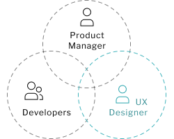
In a word, ROLE. That is, who is chosen to tackle which group of our three kinds of risks. Because valuable, feasible, and usable aren’t just spheres of concern. They are spheres of expertise. For example, you wouldn’t want your lead developer regularly sitting down with clients all day to collect feedback or making presentations to leadership about strategy and roadmaps. That’s generally the Product Manager’s job.
Obviously, putting developers and technical people in charge of feasibility is not a tough call. They write the computer code that makes the product function, so they know best about what can be built and how long it’s likely to take.
A Product Manager’s role is not as popularly understood. But, as we’ve described, they handle the work of ensuring only valuable solutions get built.
Then, there are those who ensure usability — God help us, UX Designers such as myself. I argue UX occupies the least-understood third of the triad. Which can invite the kind of problems we were having at Fitch.
No model is perfect, but the SIZE and POSITION of each circle in the Venn diagram is significant.
The size is NOT a reflection of the number of people dedicated. Indeed most product teams have several developers, but only one Product Manager. Rather, it is a reflection of WEIGHT. The importance afforded each risk. The degree to which each is taken seriously, for any given decision, by other members of the team. And by the organization as a whole.
And the position of each circle is a reflection of that sector’s AUTONOMY relative to the other two.
The Team We Had :
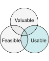
What happens when one concern predominates? In another case study, I write of the perils of product teams dominated by the Developers. In such instances, questions of usability, and even value, are sublimated to those of feasibility. Decisions that were vetted mainly for the question of whether something COULD be built, with little regard for the question of whether it SHOULD be built, regularly led to suboptimal outcomes. Like unusable products no one was asking for.
We had the opposite problem at Fitch. This time PRODUCT predominated. The folks in Product Management at Fitch were whip-crack smart about the world of banking, investing, and especially credit ratings. They knew what this market would find valuable: intelligence! Investing is all about discovering opportunity and knowing something about it others don’t.
To Product, selling this intelligence was merely a matter of making it available on a Web-site. So the priority, above all, was getting that site built. Which to them meant just getting a group of developers to build it for them.
But build WHAT, exactly? Builders have questions. Managing feasibility entails more than just writing code. That’s why the valuable and feasible circles are supposed to overlap.
There was no UX Designer involved in the construction of FitchConnect as I found it in May of 2019. The design of its user experience was happening as a result of a defacto arrangement of shared responsibility between a few enterprising developers and the Product Manager of record — let’s call him “Sam.”
Product Management is a full-time job. Which meant Sam’s designs were always incomplete. The devs would get these designs and try their best to implement them in a way that made sense. This resulted in four years of anecdotal decisions and unholy compromises.
UX Design was happening as a result of a defacto arrangement of shared responsibility between the developers and the Product Manager
The Product Manager
“Sam,” was the Product Manager of FitchConnect (FC). He worked in tandem with a peer in New York who helped coordinate the efforts of some seven individual Product Owners. Each PO was responsible for one of the various specialized data or functions offered in FC.
Sam, in short, was a character. Which made him very engaging to work with — most of the time. Other times he was a man caught between a rock and a hard place.

As learned about the business end as any of his peers in New York, Sam was additionally very enthusiastic about the creative arts. He himself was an amateur photographer.
Sam was the person most directly responsible for the unfortunate state of his product’s user experience. With the help of some well-meaning developers, and a visual design contractor or two, he had podged FC’s UX together over the course of about four years. Mainly with the aim of impressing his superiors and indulging his creative impulses. Talking to actual users was not a thing at Fitch, so what else would he do?
The good news was that he welcomed change and enjoyed working with designers. But here were a few of the challenges of working with him :
His affection for the arts would often lead him to conflate UX Design with UI Design and perpetuate that misconception throughout the Product Org. Leading powerful people to assume that what the product needed was merely cosmetic. A re-skin. But FC’s UX problems ran much deeper.
To his credit, Sam surrendered a great deal of control over the design of his product. Which is not easy to do when you’ve been that involved for so long. I’ve described the difficulty that PMs can have making this leap in another case study.
But Sam did retain a veto power based less on evidence than on the capricious preferences of both his self and his superiors in New York. He embraced an interesting editorial voice HE HIMSELF likened to that of the notorious chief editor of Vogue Magazine, Anna Wintour. Leading to such arbitrary commands as “change that color, dahhling,” even if the color he wanted wasn’t remotely among those in the palette we’d defined.
The caution and deliberation with which I myself approached design impelled Sam to nickname me Martha Stewart, a media figure Sam presumably felt compared less favorably to the edgy and sophisticated Wintour. In Sam’s mind, my job was to impress him, the way a fashion designer would Wintour.
You can’t make this stuff up.
Why did Sam think of himself as an expert in design on par with Ms. Wintour? Because with the help of a visual design contractor and a few well-meaning developers, he had overseen the construction of a Web-site his bosses were sufficiently impressed with. And that clients were paying to access.
This fallacy runs deep in enterprise software. It’s easy to conflate correlation with causation when it seems to benefit you.
It typically goes like this: An unfortunate Product Manager, like Sam, is forced to do their own design work. Eventually they somehow manage to get a solution stood up. And because their clients NEED the content to do business, client users grudgingly push through bad usability. Ultimately, a resentful userbase is established who learn to cope with arduous training sessions, lengthy documentation, and protracted help desk tickets.
“Wow,” the Product Manager says, “look at all these users! Turns out I’m not such a bad designer after all!” But client users aren’t coming BECAUSE of the design, they’re coming in SPITE of it. The people who are SOLD enterprise software are rarely the same people who must USE it. And when those users decide the juice isn’t worth the squeeze, or find similar value elsewhere, they’ll stop using it. Their employer will notice the drop in usage and ask themselves why they’re paying for this expensive software subscription no one’s using.
And, as we’ve seen, this is exactly what was happening with FitchConnect.
My Boss and ally, Mike Chesta, director of web engineering
Before I arrived, one man in Chicago understood the issues that were troubling FitchConnect. He had been part of empowered product teams in the past. Balanced teams that were not dominated by any one consideration. He saw the problems caused by foisting unfinished design artifacts and inadequate design processes on the Dev team. And of then leaving developers scrambling to account for gaps they’d had no hand in creating. That man was Mike Chesta, my boss at Fitch and the gentleman who hired me.
Mike and I became fast friends and remain so as I write years later. Luckily, we shared a lot of the same interests. Including an affection for bad action movies. Which led to shenanigans such as these (right) in October of 2019 for the office Halloween party.
Mike and I didn’t always agree, but we both understood the assignment: FitchConnect was unusable and it would go belly up if it kept bleeding subscriptions.
For two and a half years we made it our business to add balance to Fitch’s design culture, grow a legitimate UX Design practice, and pull FitchConnect out of the fire. I could not have accomplished anything at Fitch without Mike’s leadership.

I could not have accomplished anything at Fitch without Mike’s leadership
Was there a little bravado on display in the above photo? Assuredly. In 2019, Mike and I needed all the confidence we could muster. Together, we were about to do something a little risky: Imply to very powerful people in New York that perhaps they did NOT have all the answers. An endeavor that occasionally made scenes like this one (clip contains profanity and violence) from one of our favorite action movies, ‘Harley Davidson and the Marlboro Man,’ feel uncomfortably relatable.
Did WE have all the answers? No — far from it. Was there a villain in this movie? No, not at all. It’s hard to know what you don’t know. Fitch was full of truly brilliant and capable people, all doing their best with the information they had.
Were Mike and I offering a critical missing piece to the FitchConnect puzzle? I think that is undeniable. Could we have effected these changes by ourselves? Like in the movies? Guns blazing? Not in a million years.
The Research List View (RLV)
where we started
By the autumn of 2019, Mike and I enjoyed a loose charter from Product to improve the design of FitchConnect as a part of our regular work. We had updated the global header and footer with a more modern look-and-feel I designed ( see new header in below screenshot ). Mike and I joked that we had fixed “the bun” and now it was time to fix the burger. We started with the most used page layout on the site, what I’d named the “Research List View” — or RLV for short.
Take a good look at this particular instance of the RLV below. This layout was used to present some of the most valuable content in the world. But what are you seeing on this page, exactly? Click here for a closeup.
If you guessed this was a list of the five most recent pieces of research relevant to the section of the site you’d navigated to, good guess.
But what about the rest of the page? The bottom half, that is. What are those pictures? Is this a Pinterest board of some kind? Forget about these for now.
Turning back to the research, tell me, how would you show MORE of it? That is, how would you expand the list? Think you have the answer? Okay, now tell me what you would expect to see next, once you’d made that choice?

Now stop and consider all this for just a second. Why are we THINKING so hard? We are not talking about exotic functionality here. We’re talking about simple pieces of written content. Research articles, mainly. Not very much different from the kind of stuff you’d see on your favorite news Web-site. Think about the last time you searched a Web-site for news articles related to a subject you were interested in. Keep that picture in your mind as we review three key problems with this view:
1) How do I load more articles? First, why only five articles to start? Second, assuming the user is curious enough to locate it, why is the link to load more at the TOP of the list, instead of the bottom? Third, clicking that link takes the user OFF this page entirely and sends them to the advanced search experience I described earlier. Which we’ve established is confusing enough as it is without being sent there unexpectedly. Suppose you turned a faucet expecting more water and instead a trap door opend beneath you and dumped you in a river. Good experience?
2) Where do I look? Just like the advanced search experience we visited earlier, this page seems to have two discrete sections, equal in prominence, one on top of the other. There is no visual hierarchy. Turns out the Pinterest-like photo tiles in the bottom half are just links to related material the system thinks the user might find interesting given the page they’re on. But would a user make this connection given the layout? A quick trip to any news Web-site shows related and/or ancillary material exposed to the SIDE of the primary, expected content, in a manner that reduces its prominence.
3) Why a table? When you look for articles on a news Web-site are they typically presented in a GRID like you’re there to balance your budget? No, of course not. Articles by their nature are intended to be READ. Or at least scanned. And when exposing lists of articles arranged by title, it follows you’ll want to do so in such a way that promotes legibility.
Now put yourself in the shoes of a FitchConnect user. Perhaps you are an investment manager. You need information.
For $70K a year you should be seeing an easy-to-enter gateway to all the research you need. You understand that Fitch offers the kind of research investors use to inform million, sometimes BILLION-dollar decisions, routinely affecting global markets, foreign governments, and regional economies.
So why is this wonky page making all that so difficult?
How on Earth had this bizarre design come to exist?
How on Earth had this bizarre design come to exist?
Bloomberg Envy
How, indeed.
Have you ever watched a movie about Wall Street? You know, guys in suspenders sitting in an open office space, each staring, steely-eyed, into a bank of computer monitors? And each monitor is showing a wall of of boxes, each crammed tight with grids and lists and charts — all presented in a kind of retro green-screen “dark mode,” like you’d see at NASA? Those monitors are what’s known as “Bloomberg Terminals.”
During my time at Fitch I learned that the Bloomberg Terminal is rather a storied tool in the world of investing. This makes sense. They have certainly been used to win great fortunes. Lose them, too.

So it follows that someone in the Wall Street milieu, when tasked with imagining a new information-gathering tool for investors, would try and replicate the Bloomberg experience. And in so doing, hopefully, replicate that success.
Who was most deeply immersed in that milieu? I learned early that it was most likely Sam’s boss “Ethan,” whose affection for Bloomberg Terminals was made known to me.
Sam used to wryly refer to Ethan as an “influencer,” a sharp play on words. Ethan didn’t have a podcast. Rather, he was a powerful person at Fitch with strong views and an equally strong willingness to enforce conformity with these views. So it wasn’t too hard to figure out what had happened: At Ethan’s urging, either spoken or unspoken, Sam had used the Bloomberg Terminal as inspiration for the design of FitchConnect.
There was just one problem with that theory, obviously. These Bloomberg Terminals were not designed to provide a Web experience intended to expose research. But to instead expose raw data feeds from Bloomberg for the purpose of trading stocks. We couldn’t be 100% sure, because, as I’ve mentioned, actually talking to our users was verboten, but Mike and I proceeded on the assumption that Web-sites are inherently a different thing. And that not even most of our users wore suspenders
We weren’t just guessing, either. I checked the Web-sites for Moody’s, and S&P, the other two of the Big Three business credit rating agencies. Neither were offering research this way. Nor was Thomson Reuters. Or even Bloomberg itself! Bloomberg News does not present their articles at all the way their terminals present data.
Remember what I’d said about bravado and taking risks? Mike Chesta and I were challenging the design impulses of Sam’s boss, Ethan — one of the most powerful and respected people at Fitch Solutions. We were suggesting the entire theory that had driven his and Sam’s design strategy was without merit.
To Ethan’s credit, he kept an open mind and said he would absolutely yield to evidence.
And soon he would have it.
The RLV REdesign
Early sketch for redesigning the Research List View
Compare this version I designed of the Research List View (below) to the version we started with.
Which of these looks more like the expected experience of searching for news articles?
Don’t get me wrong, designing this page, and especially making it responsive, drew on all my skills as a UX Designer. But otherwise it was mostly a function of adhering to established norms of such pages. Of abiding “Jakob’s Law,” which teaches that all things being equal, users will expect to experience your product the way they do other, similar products on the Web that do the same thing.
In short, designing it did not take a stroke of genius on my part, but merely an awareness of best practices.
In his attempt to both be like Bloomberg, and be avante garde like Anna Wintour, Sam had designed something no user would expect to encounter. Seeking merely to search for news articles and other written material should not land a user in the middle of an ersatz Bloomberg Terminal experience.
This radical shift in approach to layout (below) stops the madness. By enforcing some visual hierarchy, invoking logical sections that center what the user is looking for, and offering clear paths to discovering more of it, this standard, three-column layout keeps the user’s mind on her work and off the subject of how to use this expensive tool.
More, it’s beautifully responsive. So it doesn’t matter if she’s looking at her desktop at the office or her iPad on the train, FitchConnect is there for her.

validating the RLV Redesign
Yay! You designed something better! But better according to who?
Sure, Chicago-based pawns like myself and Mike Chesta thought it was great, but we WOULD, right? We were the ones offering it. I mean what evidence did we have that it was better? Sam and Ethan had paying customers using the version THEY’D conceived. Did I mention Mike and I had zero access to FC users? And no budget for usability testing? I once asked Mike if I could pay to run some online comparison tests out of my own pocket. He warned me it might be considered a security breach.
Validation, however, would absolutely come for my new design approach. Both before and after its implementation.
As Mike and I were looking to ship the redesigned RLV, I noticed that reputation and prestige went a long way at Fitch. So with Mike’s help, I identified two high-profile people I thought could help us.
“This is the best new thing I’ve ever seen go into FitchConnect
~ Internal thought leader at Fitch Solutions, 2020
One was a really gracious gentleman who at that time was about to be promoted to the Director of Customer Success. He checked my box as being someone close enough to our users to understand what they were looking for.
The other was an extremely impressive woman who still serves as a Managing Director at Fitch Solutions. She checked my box as a person who regularly uses products like FitchConnect.
Both were generous enough with their time to sit for a usability test I’d written using a clickable prototype. Both navigated the proposed design as expected and each lent their unofficial stamp of approval to the approach overall.
In the winter of 2019, Mike and I waited with baited breath while the CEO himself reviewed the prototype and considered the evidence.
He gave us the green light.
A month or two after the new RLV’s implementation, some additional validation would land in our laps. Ironically, it wasn’t scientifically significant evidence, but the kind that moves mountains at Fitch — and probably the wider financial world in general: An unsolicited testimonial from someone of influence. About the RLV redesign, he remarked “this is the best new thing I’ve ever seen go into FitchConnect.”
All the ‘People Stuff’
What the lockdown revealed — and resolved
If you’ve been following our story so far you’ve noticed that we’re rapidly closing in on the year 2020 and the start of the Coronavirus pandemic. As the year broke, Mike and I were rocking and rolling: We had the confidence of leadership because of our success with the RLV redesign. Mike had gotten me a new Junior UX Designer to mentor and delegate work to — one Mayra Martinez. And the company had just moved our team to a nicer, newer office building in downtown Chicago.
And then Covid hit, we all went home, and two things changed — for the better. Because both changes solved problems that were slowing things down for the redesign:
The first problem was open office space. It promotes conversation and collaboration — which is good for design. However, it additionally impedes concentration and heads-down time — which is bad for design. Much of what we as designers do requires focus and momentum. These are hard to maintain when you can be interrupted by any of the other people in the office walking past your desk on a daily basis. The CTO had denied my request for a separate space for myself and Mayra.
Working from home on lockdown easily solved this first problem and my productivity shot through the roof. I finally had a quiet place to think and design the way I needed to. We could finally fully leverage the momentum we’d achieved as a result of initial successes.
In UX, designing great products is only half the work.
The other half is handling all the ‘people stuff’ that goes along with it …”
The second drag on progress pre-Covid stemmed from a problem Mike and I were having finding a Visual Designer I could work with. Mike had worked closely with UX Designers in the past and was trying to re-create a two-man UX team dynamic he had once managed at an agency, in which one designer did the Interaction Design — wireframes and such — and another did the Visual Design — colors, fonts, and imagery. This is a completely valid approach. I had worked this way in a previous engagement. But by the time Covid hit, we were on our third part-time contractor. And because they were always remote, I’d found it extremely difficult to establish a rythm with any of them. Separating Interaction Design from Visual Design is a pretty esoteric concept to begin with and none of these contractors had quite grasped the meaning. And trying to get them aligned to it over Zoom calls in the middle of an open office was not helping. By the start of the new year, I was pretty frustrated and was making the case to Mike that I should just handle Visual Design myself. That the duality he sought was just causing an unnecessary bottleneck. That if he wanted me to partner with a Visual Designer, he should get another full-timer hired so I stood any chance of establishing some rapport. I was slowly wearing him down on the subject but Mike was seated right next to me in the new office, where he could ensure he only ever saw diagrams and wireframes on my monitor.
This was tricky political ground I was treading on. Design is one of those highly visible things a lot of people want to take credit for. Mike was correct that design should not be dictated by Product. That’s how Fitch got into this mess. But neither should it be controlled by the front-end Developers, who he himself was in charge of. I write at length in a separate case study about the problems created when Engineering controls design. No org is perfect and design can work in a number of contexts, but optimally, UX Design should be its OWN thing, regarded as a consideration equal in weight to those of both Product and Engineering (Valuable, Feasible, and Usable). Such was the dynamic at the org where I’d been empowered to design the most successful product I’d ever been a part of. At that job I reported to a Director of UX who commanded the attention of every c-level in the company. And we worked in collaboration with, but also independently of, both Product and Engineering.
A brief aside: While I disagree with one of the author’s key conclusions, I kept a copy close of Leah Buley’s terrific book, ‘The User Experience Team of One,’ during my time at Fitch. In her book, Buley offers one of the most important quotes to remember for anyone in the position I was in as the winter broke in 2020: “In UX, designing great products is only HALF the work. The other half is handling all the “people stuff” that goes along with it; building support, ferreting out lingering objections and concerns, untangling a knot of competing agendas, and rallying your colleagues around a new direction.”
“… building support, ferreting out lingering objections and concerns, untangling a knot of competing agendas, and rallying your colleagues around a new direction
~ Leah Buley
author of ‘The User Experience Team of One’
( 2013, Rosenfeld )
As for the immediate problem of who was ultimately responsible for producing Visual Design, the pandemic brought the issue to a head. As you will no doubt recall, Covid started affecting the global economy. This was FitchConnect’s beat. Investors would want to know what Fitch thought about all this. So a request came down from the CEO in New York on a Monday to stand up dedicated pages in FitchConnect by that Friday. We would have the better part of four days to design and implement it. I was taking design feedback directly from c-levels who would never have understood why they were looking at black and white wireframes from myself, the FTE who’d pulled off the RLV redesign, while waiting on additional design cycles from some outside contractor. As I’ve said, Mike and I couldn’t even find other DESIGNERS who appreciated the distinction between Interaction Design and Visual Design! Could Mike have interceded and set expectations for Fitch’s officers in this regard? Helped coordinate mine and the contractor’s efforts? Mike didn’t have the TIME! He was busy doing his job, managing the developers in the run up to implementation of these new pages. Which is EXACTLY MY POINT. His was a full-time job. So was the Product Manager’s. Neither should be moonlighting as directors of design! If Sam was good with my Visual Design, THAT should be the deciding factor.
Working with Product, I designed the requested Covid pages in a matter of days. And working with Mike’s team of developers, I helped get it implemented on schedule. This kind of fast implementation of impactful design was a whole new thing for FitchConnect and really got our team noticed across the company.
There would be a bump or two ahead on the subject of who should be doing Visual Design, but the lockdown effectively ended the debate on this subject, ebabling me to move faster and more nimbly on the gargantuan task ahead of redesigning the rest of FitchConnect.
As I’ve said, Mike and I are still very good friends as I write years after this project wrapped up. How did he feel at the time about the debate over Visual Design ending the way it did? This scene (clip contains profanity and violence) from Harley Davidson and the Marlboro Man comes to mind.


I sketched this page, produced a comp in Figma, and guided the design into production in just over a week.
Racking Up Wins
Mike and I had achieved a good cadence by the time we all started working from home in 2020. Mayra, our Junior UX Designer was handling more and more of the routine updates requested by clients. Freeing me up to focus on the big redesign initiatives. Below are some key wins from that effort achieved over the ensuing 18 months. Some were completed when I created these descriptions. Others were still in progress. For each, I speak to some of the theory and methodology that drove the design.
The Multimedia Page
In this short video I overview some of the redesign work that was in progress as of July, 2021. We take a close look at the decisions I made while designing a new multimedia page. Click here or on the below thumbnail to watch the overview — it’s about 10 minutes long.

View the Visual Design Spec I authored for this feature’s implementation.
search
Remember the first example I gave of this product’s usability problems? The cryptic search experience? Sam and I worked together on that at length. Very much a case for the value of clickable prototypes — vital for validating the usability of new or novel features. In the below 5-minute video, I overview the prototype I had in progress for search at the time.

Try entering the term ‘Brazil into the global search field.
Or view more of my prototypes.
Topics page - Anticipating a more Mobile use-case
Solutions to two of my long-term goals for the redesign of FitchConnect are on display in this page.
First, to radically reduce the amount of verbiage a user encountered per page until they got to the piece of research they were looking for. To otherwise guide them with imagery and logical page flow.
And second, prepare for a time when we could consider offering a more responsive, phone-friendly version of the site in which we would detect their device and beautifully serve WHAT CONTENT WE COULD in that context. So on a phone, the tiles on this page would stack VERTICALLY instead of cascade into rows, as we see below. So much of what we offered was just written articles. There was no reason we couldn’t enable diligent users to check the news from Fitch as they rode the train into work every morning.

financials page
Certainly the most complex of the views Sam and I tackled, “Financials” were a deep dive on the true worth of a given company or country. The trick to redesigning this view was understanding what it all meant and how each piece connected to the rest. This meant a lot of stakeholder interview time with Sam and others.
Would this have all gone faster if Fitch’s UX Designer, myself, was also an expert in Wall Street banking, accounting, and taxes? Yes, but generally, those two skillsets are pretty mutually exclusive. I raise this point by way of mentioning some of the talk I’d guessed was happening in New York. Something was brewing at corporate.

Or view all of my online wireframe samples.
Or learn more about wireframes and how they fit in to the modern UX Design process.
Fateful Call
Would I like to report to Product instead of Engineering?
Sometime in the spring, perhaps, of 2021, I got a very unusual Zoom invite. It was from Mike’s boss, the CTO. Nice enough guy but we rarely talked. He had clinically the lowest levels of interest in UX Design I think I’ve ever measured in the wild. A year earlier I had requested a designated designer space with a door. He literally offered us the cloak room. Without saying as much, he was clearly relaying a request from Product to feel out my interest in the idea of reporting to Sam ( or perhaps someone else in Product ), instead of Mike.
It’s nice to be wanted. And if I thought switching would have helped anything at Fitch, it would have been a much harder decision. But it wouldn’t have helped. It would have just made me beholden to the other suboptimal sphere of the valuable, feasible, usable triad.
I told the CTO what I’ve said here: that UX is its own thing. That I’d love to report to a director of UX, if he wanted to somehow convey that sentiment.
Till then, Mike understood better there than anyone what I should be doing and how I should be doing it. And more, as I’ve said, I just plain liked Mike. We had a very constructive rapport. I’d never even met Sam in person!
I pride myself on being able to make design work in almost any context. Whether I report to UX, Product, or Engineering. I’ve done all three. And if they’d switched me without asking I would have made the best of it.
But they asked me what I THOUGHT. And I told them.
Evolving the Design Culture at Fitch Solutions
A redesign cannot happen in a vacuum.
And as I’ve said, this was not just Mike and I doing this all by ourselves.
Every enterprise software shop has a “design culture.” Sometimes the culture is based on ignoring design as a serious topic. This is when technical people and business people just kind of make anecdotal decisions about how their software should present to users and otherwise struggle through. That is an example of a design culture. A bad one. A dysfunctional one. But certainly not an uncommon one.
When I started at Fitch, as we’ve seen, things weren’t quite THAT bad. Leadership, and especially the Product Manager, appreciated the significance of design as a concern. As did a few of the developers. But mostly this amounted to lip-service. So what outcome was Fitch seeing from this very limited design culture?
Well, design was happening as a result of harried Product Owners making an endless stream of anecdotal decisions and then working with Developers to somehow force it through implementation. The outcome, as we’ve seen, was an ugly, fragmented, and often inscrutable User Experience that was costing the company subscriptions.

demystifying the mystification mindset
If you’ve ever dealt with an auto mechanic, you have dealt with someone who makes their living off specialized knowledge. Are they telling you the whole truth? Or are they keeping you in the dark to leverage you for more money? At your job, it’s less about money than prestige, politics and control. Often, the temptation to withhold information or otherwise “mystify” others as to your area of expertise can be hard to resist. This is true of Developers. And especially of high-finance types. Both had designed FitchConnect as I found it in 2019.
The result was poor crossfunctional communication, and a book of riddles masquerading as software. To break this cycle I led by example, freely explaining design theory, processes, and methodologies. “Shared understanding,” as Jeff Gothelf evangelizes, would be the new coin of the realm. There would be no more withholding of information on my watch — from eachother, or our users.
Design is a thing
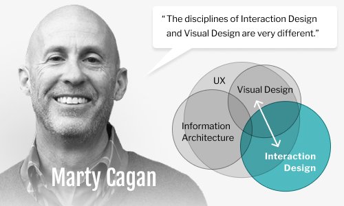
In software, as we’ve seen, Design is a discrete concern, distinct from matters strictly of value to the customer or of implementation. This is to say that Product Managers are at their best when discovering what capabilities will be valuable to the user. And Developers are at their best when they are building the features or services that will afford said capabilities. Both get themselves in trouble when they additionally try to DESIGN these features or services themselves. This is gospel for thought leaders like Marty Cagan and Jeff Patton.
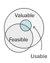
So I socialized the idea that Product Managers should push back on design they feel doesn’t facilitate desired capabilities. And that Developerss should push back on design they think will take too long to implement. But that they should both expect a conversation with UX when either presented objections of any other kind. This shift steadily moved us toward a far “holier” dynamic ( right ).

We don’t need another hero
Despite Jeff Gothelf’s best efforts, the concepts of “BDUF” ( Big Design Up-Front ) and “Design Heroes” persist like a plague in enterprise software and in 2019, Fitch Solutions was no exception. When I started, the notion that ONE skilled Designer could, in just a few months, meaningfully transform Fitch’s massive business application by aiming the right number of Photoshop comps at it, was very much the reality.
But by starting small and focusing on actual changes to actual production code, Mike and I were able to operationalize the iterative, collaborative process Gothelf describes in his industry-shifting book, Lean UX. And in so doing, we were able to build a rythm over time and maintain momentum .
When I left, the value of collaboration and iteration was fully embraced at Fitch.
Design Strata
When I started, exactly none of my stakeholders understood the distinction between Visual Design and Interaction Design ( except for Mike ). It’s not their fault — without a Designer around, why would they?
Product Owners did not understand why they couldn’t just attach a couple Balsamiqs to their tickets and trust Engineering to fill in the gaps. Surprise, surprise, developers don’t code anything you don’t explicitly tell them to.
Changing this mindset involved a gentle campaign of evangelism, racking up wins, and getting buy-in from Dev. Because what I knew from long experience was that Devs greatly prefer detailed wireframes over imagining use-cases.
After a while, everyone was using the term ‘Interaction Design’ appropriately. And as Marty Cagan has advised, it’s made for far better expectations — and outcomes.

Less is More
In enterprise software, not every page can be a dashboard. Once your user has selected a path, you have to stop showing off and let her get some actual work done. She can’t do this with a lot of ancillary junk in her face on every single page. The effect becomes that of a pinball machine. This kind of wanton overload was on full display throughout FitchConnect when I arrived in 2019.
Real designers understand that the mark of excellence in design is as much about what you take away as what you add. And that whatever is left must be arranged according to a hierarchy of visual prominence.
Referring to overwhelming legacy views as ‘inelegant’ earned me a few chuckles from those in both business and engineering when I started. But it wasn’t long before they were using that word regularly themselves.
Outcomes
Users come back
This chart speaks for itself. We transformed FitchConnect — especially its most frequently-viewed pages — from an inscrutable enigma, utterly ill-suited to its purpose, into a welcoming, understandable, expected, and highly usable Web experience. And users came back in droves. In the year following the launch of redesigned workflows, unique users of FitchConnect increased by 54%.
Fitch Solutions appoints a director of ux
In what is certainly the best evidence of the impact Mike and I had made on the organization as a whole, Fitch Solutions hired a “UX Chapter Lead.” Powerful leaders of one of the big three credit rating agencies in the world had, at least in part, heeded the advice of one humble UX Designer in Chicago. Finally, UX would be taken as seriously as Product and Engineering.
How seriously? Leadership filled the job by hiring away S&P Global’s UX Director — let’s call him “Nathan.” Should they have promoted Mike or even myself to this directorship instead? Arguably. But, ironically, Nathan’s appointment to the position was a far bigger acknowledgment of our success. As an S&P guy, Nathan was one of their own. A fellow master of the universe. Putting him on the job showed their newfound reverance for UX more than any other move they could have made. The stakes, they now understood, were far higher than they’d presumed.
It is difficult to overstate the significance of this organizational shift. In my two and a half years at Fitch Solutions, leadership had gone from kidding themselves that smart people with no design experience could just make up UX Design as they went along, to formally establishing UX as a discrete, independent, and permanent office of concern. Mike and I had backed up our evangelism with results. In 2021, usage was already up — way up. We had successfully proven the ROI of serious User Experience Design.
Time to move on
Regardless of the reason, leadership in New York had changed my manager. Mayra and I would now be reporting to Nathan. Mike hadn’t been thanked or consulted. My chance to have any say was lost with my refusal to bail on Mike. And it quickly became clear that Nathan and I would differ widely on our overall approach to UX. As I’ve said, this shift was in its own way a tribute to mine and Mike’s successes. But in my view, the whole thing could have been handled with significantly more finesse.
What do you think? Drop me a line and let me know.
I left Fitch Solutions just shy of Q4 in 2021. And within 5 months of Nathan’s hire, both Mike and Mayra had done the same. The departure, as you might imagine, was bittersweet. We were proud of what we’d accomplished, but sad to be parting ways. I left before Mike did, and I’d be lying if I said this scene from Harley Davidson and the Marlboro Man doesn’t come to mind whenever I think about it.
Ride on.
UX Work I Rendered for this Project
testimonials
“I brought in Erik to tackle a significant challenge - come into a company that, despite offering an enterprise-level web application, had practically no awareness of User Experience, Interaction Design or Visual Design. We needed an experienced lead who could build the department from scratch while championing the role of UX in the organization.
Erik oversaw a complete re-architecture and redesign of the platform, managing a team of UX and Visual Designers while collaborating with stakeholders to achieve a branded, intuitive experience.
Thanks to Erik, the UX department has become an integral part of the roadmap and development process, and has expanded into other product lines throughout Fitch Group.”

“I worked closely with Erik as my UX Lead during my time at Fitch Solutions. I say with confidence that the guidance and mentorship I received from Erik has been an invaluable and empowering experience.
We began working together as a small UX duo in a large organization where UX design was a brand new concept. Erik demonstrated effective design leadership as he advocated for our department. Throughout that process, Erik made sure I was fully included in the efforts of educating stakeholders about our roles, describing the importance of good design for good business and presenting innovative ideas. He was fundamental in creating and leading the course to bring user-centered design initiatives to the organization.
Erik made it very evident from the start that he was fully invested in cultivating an environment for collaboration and learning. He understood my drive to learn and provided resources and insightful advice from his experiences as a skillful and successful master of his craft.
Despite the sudden change to fully remote work in the chaotic year of 2020, our UX team produced a high volume of valuable contributions to the larger team. We would have not been able to do that without Erik's direction and management skills. He maintained a spirit of collaboration by conducting remote brainstorming sessions and was attentive to my questions. There were times where a cognitive block on a complicated project would briefly halt my progress. Erik was supportive through those times as he would guide me to the point where I could regain momentum and identify a solution.
Erik also showed support of my professional growth outside of design. I mentioned to him my interest in applying to the Gender Equity in Tech (GET) Cities Chicago fellowship. Immediately, he asked how he could assist in that process as he understands my interest in those topics and the importance of supporting initiatives focused on diversification of the tech workforce.
It has been an honor to work with such an intelligent, enjoyable and effective UX Lead. I assure future designers that work with Erik will agree!”
