Projects > Redesign - 2023
eSMART
REDesign - 2023
When hospitals need to create and maintain medical records for their patients, they use a third-party solution called an “EHR.” As of 2024, Epic held 42.3% of this market. IMO Health offers integrated data service solutions for EHRs. Think of these like aftermarket upgrades to your car. In 2021, IMO’s Epic upgrade, eSMART, enabled doctors to “clean” a patient’s records of outdated or redundant diagnoses. So why weren’t doctors using it? This is the “epic” story of how I re-imagined that powerful tool and solved its adoption issues.

redesign vs. re-skin
The word “redesign” can mean a lot of things to a lot of people. Some may assume a redesign is just a matter of sprucing the UI up with some clean new colors, images, and icons. That is not a redesign, that is a RE-SKIN. The difference is akin to that between UI and UX. For a REDESIGN, the scope will additionally encompass EVERY ATTRIBUTE that bears on the end user’s ultimate experience of the product: From overall strategy, to design approach and sensibility, to the business logic and IA.
In short, a redesign is a re-imagining.
cleaning the clutter: what esmart was intended to do
But often a PL gets so long as to be unwieldy. Some problems are “LAPSED,” as in no longer relevant to your current state of health. For example, a broken leg that healed 7 years ago isn’t affecting you now. Others are DUPLICATIVE. For example, three different doctors may have diagnosed your same case of colitis three separate times. Still other problems are RELATED. If a chronic condition worsens, for example, from stage 2 to stage 3, there’s no need for two entries.
Everyone in the United States who has ever seen a doctor has what’s known in the healthcare industry as a “Problem List” — or “PL.” It is a record of every medical problem you have ever been diagnosed with; from halitosis to heart disease. Your PL will follow you around from one doctor to the next and grow in length over time. And your doctor will reference your PL to get an understanding of your overall health each time you visit.

EHRs like Epic are not set up to organize and categorize a patient’s Problem List in ways that enable doctors to identify these three kinds of clutter.
But IMO Health is.
Can’t this kind of “cleanup” just be automated? Absolutely not! Each change to a patient’s Problem List requires a doctor’s professional judgment. In the healthcare biz, a patient’s PL is sacrosanct. Just as HIPAA laws prevent your PL from being shared with unauthorized people or organizations, professional convention prohibits computer algorithms from changing it without oversight.
Enter, eSMART. This add-on to Epic will look at any given patient’s Problem List and sort each problem into useful categories. In this way, eSMART can call out the clutter, make recommendations, and afford the attending physician options for “cleaning” it. Old problems can be archived. Duplicate problems can be deleted. And related problems can be aggregated.
Still a little fuzzy on the concept? This video provides a somewhat deeper dive as to the value eSMART was attempting to provide.
Why weren’t doctors using eSMART?
the old version

Despite IMO’s best intentions, eSMART was definitely NOT flying off the shelves. It suffered from woefully low adoption. After getting an invitation to try it, metrics revealed doctors would see it, try it, and and then never use it again.
But why?
There were an array of reasons so many well-intended IMO products struggled. Most can be traced to organizational, structural, and strategic decisions common to growth-state companies. As I write in a separate case study about a different IMO project, Engineering’s outsized influence on matters both of product management and of design promoted an organizational tendency to build first, ask questions later.
Also, eSMART was wildly unusable.

heuristic highlights: The Big Stuff
These were the big problems. The “themes” from which all problematic UX “plotlines” arose.
Inevident self-evidence
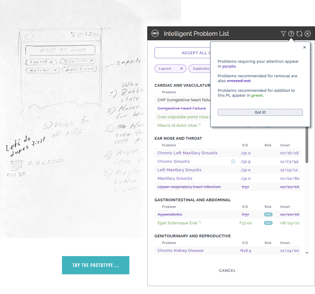
Pretend for a moment you are a busy doctor. You’ve been told there may be problems on your patient’s list that don’t belong there. And you’re told there’s an app that can help. You open up that app and see this UI (left). How would you get started? This product fails the first rule of UX: Don’t Make Me Think!
Poor “posture”
Web apps assume one of two “postures.” “Sovereign” and “Transient.” Epic and eSMART are perfect examples of both, respectively. Cooper writes transient apps should be “obvious and helpful,” presenting controls “clearly and boldly.” Yet, as we’ve already established, we’re not even sure what it’s FOR.
“Mystery-Meat” icons
The problem of “Mystery Meat” iconography is alive and well here. Because while we understand the trashcan icon in this UI (left) probably means ‘Delete,’ what about the arrow icon next to it? Even a doctor wouldn’t guess it meant ‘Resolve and move to patient history’ on the first try. And it’s a key function!
Ink by the barrel
When comparing the amount of “ink” NEEDED to represent data in a grid or chart, to that amount actually USED, Edward Tufte himself recommends the smallest delta possible. And accepted design theory cautions against using boxes to group related content. This UI (left) flouts both design principles.
Unmitigated cognitive overload
Too many options will tend to impede the ability of a user to make choices. And there is only so much a user’s mind can take in and operationalize at a time. So, while our persona was adept at parsing complexity, this UI was confounding. Instead of a clear visual hierarchy, the UI presents a kind of flat multitude.
heuristic highlights: the small stuff
Remember the book Don’t Sweat the Small Stuff? Yeah, that’s not a thing in UX. The designer’s charter is to sweat the big stuff, the small stuff, and everything in-between. Users can be utterly defeated in their experience with your product because of one confusing icon. Or one poorly-worded label. Here are eight examples of all the little things eSMART was doing to frustrate or alienate its users. Think of each as an opportunity for a user to get confused and never use your product again.

Exotic affordances
You’ve heard of checkboxes to group-select data. Now you can group-select a … function …?

What about ‘About?’
About info would not be interesting to the intended user of this transient app in any universe. Total distraction.

Scattered help
Generally, help content does not belong in a transient app. Especially not in three different places.

Tab abuse
Avoid invoking fewer than three tabs. If invoking only two, ensure it doesn’t look as if one or more are missing.

Misleading CTAs
These buttons are among the least important, yet they’re colored to be the most conspicuous on the page.

Repetitive row options
Users are not helped when shown the same three options in every row of a data table. They are overwhelmed.

Are these fractions?
A user would get the meaning after a beat or two. But why make her think? Say ‘2nd of 3,’ not ‘2/3.’ Use English.

Mysteriously greyed-out button
Why show a button that can’t be used? Especially in as tempting a place as the bottom of the page?
For more, this video provides a comprehensive look at all the design decision-making that went in to addressing eSMART’s usability problems.

“If we want users to like our software, we should design it to behave like a likeable person: respectful, generous, and helpful”
Headwinds
As with all projects of any significance in enterprise software, this effort presented a number of impediments to progress besides just getting the design right. These included a handful of small blockers and one great, big, giant one that almost tanked the whole endeavor. Let’s take a quick look.
Breezes
No access to actual users. Unfortunately, in enterprise software, especially for orgs in a growth state, actual end users are often spoken of as one would a rumor. And IMO was no exception. There is usually a big difference in the interests of the people who BUY enterprise software at your client org, and the people who end up having to actually USE it on a daily basis. I dealt with this lack of access by making the most of the access I DID have to the physician consultants at IMO.
Organizational and structural headwinds. IMO Health, for reasons I touched on above, had a chronic design ingestion problem. Because the org was dominated by technical people, UX had generally been treated as an afterthought until I arrived. I’d made in-roads, but because IMO offered a scattering of different products all built and maintained by decentralized teams, UX evangelism was often a game of whack-a-mole. I dealt with this by ensuring eSMART’s devs were always looped in.

Forced waterfall design dynamic. Generally, I am an enthusiastic practitioner of the Lean UX process, which depends on an agile environment. But because our app opened up in Epic, and because Epic is notoriously parsimonious in matters of access to its codebase, we could not iterate updates to our product. We had to “big-bang” one, whole new version and pray, at the very least, we didn’t make adoption worse. I dealt with this by taking the praying part out of the equation. At every phase, I sought evidence and designed to it.
Tornado

Excerpt from 2023 article I wrote for IMO Health
The biggest challenge I faced during this project was the mental model of UX Design stubbornly inhabiting the mind of one of the most talented and engaged product managers I have ever worked with, one David Arco.
To be clear, 90% of our interactions were positive and productive. Together, we achieved truly remarkable levels of synergy.
But the “winds” of disagreement representing the other 10% very nearly blew down everything we built over the course of a year.
But it wasn’t Mr. Arco’s fault, entirely. I address the question of how he had certainly come to embrace this mental model in an article I wrote for a company blog just as the redesign was going live. I’ve excerpted the relevant portion here ( right ).
In short, his mental model was born of necessity, as are so many things at orgs in a growth state, like IMO. In such contexts, resources are tight. And, as IxD author John Armitage writes in his article about designing in agile environments, enterprise software suffers in general from a dearth of good designers.
So exactly what WAS Mr. Arco’s problematic mental model of UX Design? It was akin to the distinction I draw above between a redesign and a re-skin, but subtler.
Did Mr. Arco ever literally use these words to describe the below mental model he perhaps unwittingly embraced? No, of course not. This was my assessment after working closely with him for months:

Yikes.
In a word, NO.
Let’s explore the wrongness here by offering a little contrast. Below we see the UX Designer’s mental model of UX Design:

Was my situation uncommon? Far from it. Kara Pernice, the President and CEO of the foremost authority on UX best practices, The Nielsen Norman Group, saw fit to highlight this exact issue in a YouTube piece called Why UX is Difficult. See especially her third point.

“Just because someone likes UX, or is invested in it, doesn’t mean he’s good at it.”
Research

In UX, it cannot be said enough: You cannot design something you do not understand.
This should seem axiomatic to any reasonable person. But when the pressure is on and deadlines close in, I have seen contractors and FTEs, both with the ostensible title of UX Designer, sally forth without being able to explain what the product they’re “designing” is even SUPPOSED TO DO at a fundamental level. Imagine the poor user down the line in such cases, whose job depends on using the finished product effectively.
The sheer scale of the research I conducted in order to become an expert in what eSMART was supposed to do, how it did it, and what users were struggling with, cannot be adequately captured here. Suffice to say, this Figjam (right) was typical to perhaps 20 others like it, over the course of the project. And my activities during this phase can be summarized as follows:
Conducted innumerable stakeholder interviews at IMO ( regrettably, we did not have access to actual users ), especially the physician consultants we had on staff.
Became the product manager’s student in all matters eSMART, especially its intended ROI.
Studied the SMART ( Substitutable Medical Applications and Reusable Technologies ) products IMO made for other EHR systems, like those maintained by Cerner and NextGen.
“A real person, not a corporation or even an IT manager, interacts with your product. Therefore, you must regard her personal goals as more significant”
Design Direction
Shock and awe
Looking back, however, I would have loved to have had the chance to test this design. Often, an experienced designer’s very first instinct is the right one and the merits of this approach, in retrospect, stand out in rather stark relief to some of the others we ended up chasing down rabbit holes.
Why?
First, as I’ve described, the user would ALWAYS have the patient’s PL in context. did we really need to reproduce it in eSMART, some 600 pixels to the right?
Second, while Arco wasn’t wrong about doctors noticing clicks, there were two things wrong with that pushback: First, for the existing version, and ANY version of eSMART, clicks were already inevitable. Such versions would invariaby invite consideration of potentially long lists and inevitably require clicks for taking action on an interspersed sub-set. Second, it’s well-established UX theory that clicks get noticed much less when they’re logical and keep the user in their flow.
These low and medium fidelity artifacts ( below ) capture my very first redesign direction, a most RADICAL departure from what we had. Effectively boiling down the product’s functions to a bare-minimum, easily-consumable summary page. Instead of scrolling and scanning, the user would either trigger a bulk cleanup per group, or click through to explore each group and proceed with greater specificity.
The Product Manager’s reaction was gracious but strong: First, he insisted, that even though eSMART would always open in Epic next to the patient’s problem list (PL), it was vital to additionally retain the context of the patient’s full PL in eSMART. Second, he insisted doctors, as a persona, were notorious for “counting clicks” and for disparaging software that seemed to require too many.
I was new to IMO at the time and it was vital I build rapport with my product manager. And I had come to appreciate Mr. Arco’s vast industry knowledge as well as his patient tutelage. So I didn’t balk.

As mentioned, the Product Manager, Mr. Arco, dismissed the above design direction out of hand. Which was absolutely his prerogative. After all, eSMART was his product.
This design direction absolutely got noticed, however, and earned me a “kudo” award from a colleague who had experience working within Arco’s constraints. At the very least, the shock and awe created by this design signaled to Arco that I wasn’t here for a nip-tuck of eSMART. And that he should expect bold ideas in pursuit of solving eSMART’s adoption problems.
While I was not able to demonstrate this design’s value, I really had no opportunity to do so, either. As I’ve described, there was no infrastructure in place for testing design direction with actual users. And access to such users would have been necessary to validate my hypotheses around eSMART’s use in the Epic context.
That there was, manifestly, a new UX sheriff in town.
Pardner.
validated design!

After weeks of iteration and internal validation, I captured the below design in an immersive, clickable prototype. Then I wrote a usability test and helped a third-party vendor identify external participants that matched our target persona: general practitioner / family doctor.
Participants were given a hypothetical scenario and asked to “clean” a fictional patient’s problem list (PL) of extraneous entries in a mock Epic environment ( try it yourself, or watch a video overview first ).
For the task, ‘clean patient’s PL to your satisfaction,’ we had an 85% success rate.


Participant praise
Occasionally, there is the usability test participant who utterly makes or breaks your design. Participant 3, a family doctor with dyslexia was one of my most memorable examples. She confirmed in every way possible my choices for font, color, and spacing. I had removed all the unnecessary “ink,” unboxed the data, and invoked a visual hierarchy that ensured this doctor did not struggle with her unique accessibility needs. I doubt it would have been the same for the old design.

Normally, this would be the end of the case study. Champagne corks popping, lessons learned, etc. etc.
It was all over but the shouting: Let’s get the devs coding!
But, as I was about to learn, we weren’t even HALF done.
Product Manager Insists on His Own Design Direction
adding problems - in more ways than one
Well, Mr. Arco, in keeping with his mental model of UX Design, came to me with his own, very specific, design idea shortly after rejecting my first attempt at iterating what we had. This was a real problem. David Arco was one of the smartest, most engaged product managers I had ever worked with. He understood his market and his clients. But alone, industry awareness does not remotely confer adequate design skill. In short, David Arco was not a designer.
And his design idea was emblematic of this fact.
Just as design was wrapping up for the above approach, the Product Manager of eSMART, David Arco, told me a capability had been worked out on the back-end that would enable IMO to not only suggest problems for REMOVAL, but to suggest problems for ADDITION — based on various factors relating to a patient’s medical history. You will recall we were stuck in waterfall mode and Arco did not want to start coding a design that didn’t afford this capability.
What did all this mean for the design we had?
faustian fork in the road
I am a professional. So this is what I did: I told Mr. Arco that I viewed his design idea as unwieldy and odd. That, among other things, it broke a fundamental rule of UX Design and would engender the same kind of user hesitation we were seeing in the old version. Then I told him I would try my very best to make it work to his satisfaction, SO LONG as we could do another round of usability testing when it was prototyped. He agreed.
Imagine working on something for months, refining it, getting tough feedback on it, staying humble, and then finally getting it demonstrably right. Only to be told that none of that counted now and all your hard work was going in the trash. Worse, now your job was to polish up an amateur’s idea for replacing it and doing all the leg-work required to get it fleshed out. Worst of all, you have real doubts about the new design’s chances for success. What would you do?
train wreck

The design we landed on for his approach was captured in the completely new clickable prototype we see below. When we tested that prototype with a fresh group of doctors, the success rate was a miserable 20%.
What happened?
UX Design is by far the most misunderstood job in enterprise software ( if not professional life, generally ). And because some of it is subjective, everyone gets to have an opinion. Which trains many to assume they could probably handle it themselves if they really had to.
The problem with that line of thinking, however, is this: UX Design is actually a thing. Getting it right can mean the difference between a product — and by extension, an entire business strategy — that succeeds or fails. Whole organizations, including universities, spend tens of thousands of dollars and hundreds of hours training just one person to get UX right.


So when David Arco appointed himself lead UX designer for his product ( and effectively demoted me to UI designer ), he made the exact first mistake UX Designers are taught never to make: He forgot he wasn’t the user. He assumed that because he knew his clients, he knew how to design for them.
And now he stood to lose almost a year of effort to his hubris.

“One of usability’s most hard-earned lessons is that you are not the user.”
Actual UX Designer to the Rescue
back to the future
Arco had restored my decision-making power in tacit exchange for lightning-fast progress. We didn’t have any time to test a dramatically new approach, so I told him we would pivot back to the validated design we had and that I would somehow incorporate the new requirement. There was not enough time to build another clickable prototype, so I pivoted to rapid, paper-prototyping. You can sense the speed in the below excerpt.
No time for I-told-you-so’s
To the Product Manager’s credit, he was sufficiently, and immediately chastened by the poor usability test showing for his design idea. Was I enjoying this comeuppance for Mr. Arco’s usurpations? I really couldn’t afford any of that. We were now way behind schedule on one of my first big projects at IMO and I absolutely did NOT want to be associated with the kind of calamity this threatened to turn into. Nor did I want UX to be seen as a blocker, generally.

Above, rapid “paper”-prototyping ( in Figjam ). Figuring out the UX for enabling users to add new problems while removing old ones.
Interaction Design ( IxD )
What IS interaction design?
Good question. In very general terms, it is anything on the front end expressed in terms of FORM and BEHAVIOR.
And it is INDEPENDENT of UI Design ( aka Visual Design ). To separate the two, you might find the following analogy useful.
In sports like football, there are “plays.” Each one is a kind of miniature plan. When captured graphically, they typically show forms representing players in relation to each other and arrows describing where each should go. It doesn’t matter what anyone’s wearing so long as offense is distinct from defense. The Chicago Bears could run the play, or the LA Rams could. THIS is IxD. UI Design, by contrast, analogizes to the colors, fonts, branding, and logos that appear on the players’ uniforms.

IxD: Form and Behavior.

UI Design: Colors, fonts, branding, and logos.
For a more in-depth understanding of Interaction Design, I highly recommend the book ‘About Face: The Essentials of Interaction Design, 4th Edition.’ As well as the various resources offered by the Interaction Design Foundation.
behavior over time
Such is the “tick-tock” of IxD. A thing was one way, something happened, and now it’s another way.
All such transformations involve SEQUENCE. And many of them involve MOVEMENT.
TIMING is important to sequence only inasmuch as causal events precede caused events. But for movement, durations are involved: Should an alert linger for two seconds or five? Can the user read its content in the time alotted? And so on.
We’ve described Interaction Design ( IxD ) as encompassing anything on the front end expressed in terms of FORM and BEHAVIOR.
Let’s talk about the BEHAVIOR part.
By definition, behavior unfolds over TIME.
An unclicked dropdown, for example, might show a label, ‘Select delivery method.’ A user clicks it, sees a sort of animated drawer slide down, and then selects one of the options therein. Now the dropdown label reads ‘Express Delivery.’
The point being that accurately describing form, behavior, sequence, timing, and movement adds up to a lot of nuance in your design deliverables.
A LOT of nuance.

describing ixd for developers
As we’ve seen, the need for nuance can pile up fast in IxD. Especially for interfaces like eSMART, where a lot of options and interactivity need to be presented in a limited amount of space.
And in order for nuance to get coded as intended, you need one very important thing. Specificity in your design artifacts. Specificity that covers all the nuance we just dicussed: form, behavior, sequence, movement, and timing.
Let’s explore the subject of specificity briefly from the perspective of designer aptitude. To do that, if you’ll indulge me, let’s embrace a new analogy. I refer you to our equestrian imagery, right. Assume your solution was a horse that needed to gallop and your developers are ready to code it.
A non-designer will give them A. Maybe he’s the product manager and assumes the devs will figure out the galloping part for themselves. They’ll have to discern B, C, and D without a designer’s guidance. In my experience, this rarely works out for the best. Devs aren’t in the IxD business and don’t want to fill in the gaps of incomplete design. Such disconnects lead to unusable solutions and multiple re-factors.
A less-experienced designer will give them A, B, C, and D. Maybe prototyped so each step clicks into the next. Maybe she even baked in mature, high-fi UI Design. She feels she’s done when she sends devs a link to this prototype. This CAN work in limited cases, where scope is small and choices are few. Because this is just the “happy path.” What about edge-cases? What happens if on step B something prevents step C?
A more-experienced designer will give them A, B, C, and D as a default. Once that happy path has been established, he’ll give them design for each exceptional or error condition. On step B, for example, if there are two things that can keep the user from getting to C, he’ll call those out and describe what should happen in the UI. He understands that high-fi visual design can be addressed SEPARATELY for this amount of scope.
So how did I capture Interaction Design for the eSMART development team in such a way that maintained rapid forward motion at all times against an absurd deadline? And how did we get the redesign implemented with ZERO re-factors along the way? Broadly, by doing two things: First, by separating UI Design and Interaction Design. And second, by keeping the devs’ documentation flexible and easily updateable. I spend about 5 minutes in the below video discussing it.
Now let’s say your horse needed not only to gallop, but trot, “canter,” and “pace.” Then jump, race, and perform “dressage.” And any number of other complex things. That was eSMART ( and all product design of any complexity ). Each capability must dovetail seamlessly with all the others. And the often multiple edge-cases for each must unfold intuitively and consistently. Imagine the potential for exponential need in design to be captured.
the why’s
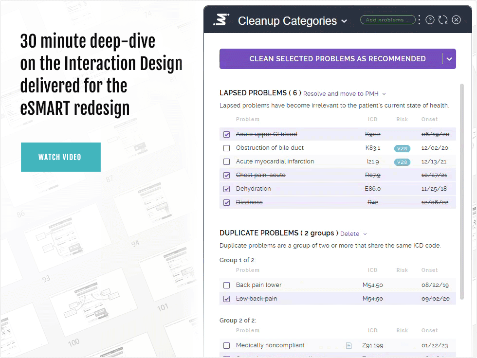
Interaction Design accounted for no less than 50% of all the UX work I did on this project. We touched on some WHYs to start, but mostly till this point, we’ve looked at the HOWs. The research, the prototypes, the politics, and the pivots. But if you’re game, let us now explore the main drivers of my design decision-making. To do so, I produced the below 30-minute video. Because, as we’ve established, so much of IxD centers on the nuances inherent to behavior: sequence, timing, and movement. And, since you’re not coding the design, video is a more appropriate medium for you.
I know, who has 30 minutes nowadays? Here are some quick highlights:
I compare and contrast the old version to my redesign ( 9 minutes )
I discuss the visual hierarchy invoked in the redesign ( 1 minute )
I discuss the importance of clear calls-to-action ( 1 minute )
I apply Jakob’s Law to the old version and the new ( 2 minutes )
I discuss the IxD artifacts I gave the development team ( 6 minutes )
scenes from the wire
Each of the developers charged with implementation had a link to a single wireframe deck on a shared drive. I iterated and curated this deck well into code time, soliciting feedback from both the Product Manager and the developers as we went along. The result? Speed, shared understanding, and zero re-factors to go-live.
“ Form, function, content, and behavior are so inextricably linked that many of the challenges of designing an interactive product go right to the heart of what [ that product ] IS and DOES ”
Visual Design
saving time and avoiding mediocrity
The best thing about waiting till all the IA and IxD have been matured before delving into high-res Visual Design, is the savings in TIME.
Because, while Visual Design can be one of the most rewarding parts of UX Design, pushing pixels can be a slog. You do not want to have to throw out whole sequences you’ve comped-out just because they were changed drastically after the fact — or didn’t make the cut for implementation.
Getting stakeholder consensus can cause slowdowns as well. Luckily, our usability test participants had nothing negative to say about the aesthetic. And the Product Manager liked it fine. We were breaking new ground in a discrete sector of the business, so picky stakeholders were down to a bare minimum.
So my last step in the run-up to implementation was Visual Design. I created high-res comps like this one ( right ), in Figma, with liberal use of that tool’s much bally-hooed Auto Layout feature. And to ensure pixel-perfect implementation, I followed the comps up with a highly-detailed Visual Design Specifications document ( code time was early in the year 2023 and dev mode in Figma wasn’t quite a thing yet; neither were the red-lines or annotation features ).
As with the wire, all the devs involved in implementation had a link to this single shared deck that I iterated and curated well in to code time.
Through comments and iteration, this spec became the nexus of communication about Visual Design for this effort. An ongoing conversation, of a kind, between myself and the dev team.
Why CONVERSATION, you ask? Would not INSTRUCTION be the only form of communication necessary in this context? As in, ‘I SAY, you DO?’
It’s rarely that simple in enterprise software. Ugly ducklings abound in B2B Web apps because such solutions are always purchased for their utility, not their curb appeal.
The problem is this:Utility requires IxD. And, while distinct from each other, Visual Design overlaps IxD. And you cannot have good usability without good IxD. And you cannot have good adoption without good usability. Visual Design, therefore, is a necessary component of the product’s utility. By transitive property, if you will.
As the old version of eSMART proved, just because their hospital PURCHASED it, does NOT mean the doctors will USE it. And if they kept NOT using it, the hospital would NOT re-upp the subscription next year.
So, yes, a CONVERSATION.
The fact is I didn’t have time to lay out the design theory connecting Visual Design to the product’s utility or adoption rate for the developers the way I just did for you above. And if I’d tried, odds are I’d have gotten mostly puzzled looks. Or worse.
If this were a public-facing or B2C solution, sleek, pixel-perfect Visual Design would have been a bigger priority. Meaning I could have feasibly mounted my high-horse without fear of reprisal. But often, developers on an enterprise B2B solution require a bit more cajoling.
Which brings me to David Letterman.
Let me explain.
I’ve found that making repeated demands of busy, over-worked developers coding against impossible deadlines, especially as regards NON-FUNCTIONAL, purely AESTHETIC issues, like medicine, goes down better with a spoonful of sugar. The “sugar” in this case being a Letterman-style “Top Ten List” — see slide 41 of the spec.

Visual design and accessibility
Visual Design is the part of UX Design that most people can relate to. The one that appeals most to individual TASTE. Tastes can vary wildly so it can be tempting to think of it as arbitrary, which in turn will invite the unfortunate supposition that UX itself is arbitrary. Neither is true. As any graphic designer will tell you, there are fundamental principles of aesthetic apppeal. And as any UX Designer will tell you, these principles bear on the IxD of a digital product, especially its accessibility.

Doctors are human and their profession does not immunize them from pathology. One of our test participants, a family physician, occasionally struggles with dyslexia. So her experience of the above design direction was of particular interest.
Outcomes
textbook launch

Getting validated, compelling, and attractive new product design implemented and released into the wild is never easy.
Which is why it is always my primary concern.
And it paid off:
By cultivating the development team and ensuring they always had what they needed WHEN they needed it, I was able to incentivize their interest in coding the solution AS-DESIGNED. To outside observers, providing higher levels of design specificity may look like overkill. But it’s a dev team’s best shot at delivering with zero re-factors, ensuring all their hard work isn’t wasted, and being able to look at the results with a sense of accomplishment and pride.
As of these words in the spring of 2025, eSMART is live in Epic for subscribers, and helping doctors all over America keep their patient’s problem lists “clean” and organized.

happier, more efficient doctors
Managing patient problem lists is a known barrier to effective care. And against some pretty steep odds, we were able to put something into the hands of doctors we knew they could understand quickly and start using immmediately. Which, after all is said and done, was the entire point.

internal buzz, a higher profile for ux
UX and UI Design often get conflated in enterprise software. And because UI Design gets viewed as arbitrary, so does UX. All this was especially true at IMO Health before I arrived. The success of the eSMART redesign got noticed, however, and helped shift the UX narrative at IMO. I wrote an article for the company blog to layer the excitement with awareness of UX.

grateful product manager
Navigating the relationship with a Product Manager can be tricky for a Designer: You want to give them the most valuable design for their product. And you don’t want to be seen as disregarding their instincts in so doing. I had successfully threaded that needle with evidence, rigor, and humor. Mr. Arco expressed his gratitude both officially and unofficially.
UX Design I rendered for this project
executive summary
In 2022, IMO Health was attempting to help doctors manage their patients’ medical records with an add-on to one of the biggest medical record software systems, Epic. The add-on was called eSMART and it identified old or irrelevant records for review and removal. The problem was low adoption: Doctors would try and use eSMART, give up, and never try again. This was because while powerful, eSMART was not a usable product.
I was brought on to redesign it for usability and solve its adoption issues.
To do this, I first became a student of the product, the market, and the personas. And, after overcoming entrenched organizational barriers to accepted UX Design methodologies, I designed and validated a worthy solution.
Then the Product Manager came to me with new requirements and a whole new design approach he had devised himself. I went along with it on condition we tested it like before.
The results spoke for themselves. My original redesign tested better by a margin of 65%.
With a fast-approaching deadline, we pivoted back to that original design and I worked the new requirements in to that approach. To do this effectively, I rigorously applied fundamental principles of Interaction Design ( IxD ). And to address the time component, I separated IxD from Visual Design so the developers could ensure the product at least BEHAVED as designed. Once we had established momentum, I was additionally able to apply a modern look and feel.
Outcomes were optimal across the board: a more usable product delivered on time.
video
Why read when you can watch? This 30-minute presentation covers key design decision-making.