Projects > Product Design - 2024
NextGen
Product Design - 2024
To check your medical records, doctors use what’s called an EHR. IMO Health offers a kind of add-on to the NextGen EHR. It enables doctors to curate medical records in ways NextGen alone could not. The add-on came as an on-prem integration, but, in Q3 of 2023, IMO decided to move those capabilities out onto the Web. This provided an opportunity to re-imagine the product’s troublesome user experience. This is the story of how I did that by using prototypes to elicit feedback. And by iterating based on that feedback.
Where We Landed
Below we see the second prototype for a Web version of IMO’s NextGen add-on. It does everything the old, on-prem version did. But in more valuable and usable ways.

Where We Started
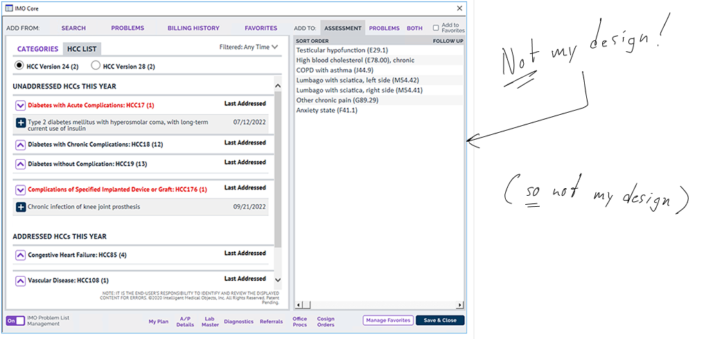
This below was the old on-prem version of IMO’s NextGen add-on. In a word — arg! Crowded, odd, and devoid of visual hierarchy. The UX plays hide-and-seek with vital functionality. And flouts multiple design fundamentals in the process. Especially “Jakob’s Law.”
The Challenge
The Value Prop
I describe the work I did for such a solution that works inside Epic, the most popular EHR, in a previous case study. As I write in 2025, NextGen’s market share was ranked fifth behind Epic outside big hospital networks.
IMO’s add-on makes two critical tasks in NextGen quicker, easier, and more efficient.
The first is specificity. That is, locating the most accurate diagnosis.
The second is grouping and curating patient diagnoses in useful ways. It is useful to a doctor, for example, to understand which problems are covered by Medicare.
Did you know there are more than FIVE MILLION possible diagnoses doctors must choose from to correctly name a given patient’s disease or injury? Even the most common ones like diabetes come in a multitude of variants and stages. And they evolve yearly. The systems doctors use to specify and record a patient’s diagnosis are called EHRs. The problem is these EHRs do not always do a great job of keeping up with all the names for all the different diagnoses. Or offer the best ways of grouping them usefully.
This is where IMO Health comes in. They offer solutions for “wrangling” all this terminology. These solutions work inside the EHR doctors use every day — like a kind of add-on.
The Challenge I thought I had
According to the Product Manager, my task was pretty straightforward: We needed to take all the functionality from the old, wonky, on-prem version of IMO’s NextGen add-on and move it out of the highly constraining NextGen data environment. We needed to move it out to the Web, where we could offer it to doctors in a more intuitive way. Doing so would additionally make the product more consistent with similar solutions we were selling to our clients who used the Cerner and Epic EHRs.
The challenge I actually had
It turns out there was far more to this challenge than the Product Manager understood. And this was because he did not understand his users as well as he thought he did. He thought the original product was already helping doctors with BOTH of the two key tasks I described above.
But as I would learn, that wasn’t remotely the case.
Research
IMO’s NextGen add-on, like nearly all of their products, offered some truly arcane capability. So the sustained research effort for this project was typical. Shown below are my notes from a stakeholder interview I conducted with two SMEs at once. Just one session of a dozen or more held with them and others. These notes are definitely indicative of the scale and complexity. And of the rigor with which I gather research. As well as the speed, perhaps, with which I gather it.
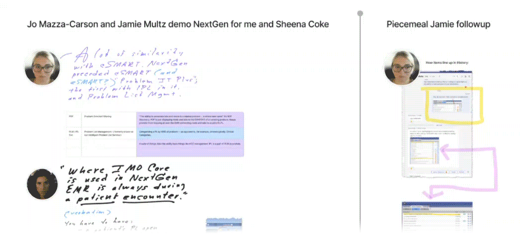
Notice the attribution with photos, so I’d know with whom to follow up in case the need arose. And the screenshots of, and comparisons to, other, similar IMO products. As well as my own asides — some of them humorous.
The First Prototype
bold ideas, rapid learning
When scientists at the CERN need to find out what’s inside subatomic particles, they crash them into each other and see what pops out. I used this metaphor at IMO to describe my reasoning behind rapid prototyping: I wanted to “crash” new user experiences into a user’s mind and see what pops out. That’s what this first prototype was for. It asserts some bold ideas and some radical pivots and even managed to upset a stakeholder or two. But the learnings it produced got us to the right design.

Ready to treat your first patient, doctor? See if you can add Lupus to this fictional patient’s list of medical problems. Feeling really ambitious? Take the full test I wrote for internal participants chosen for remote guerilla usability testing.
test Results
IMO Health employs a number of actual physicians to consult on both business and product strategy. So while we had a few other kinds of internal participants for my campaign of guerilla testing, the one most closely matching our target persona was one of these doctors, making his feedback more relevant. As always, though, the MOST relevant appraisal of the prototype came from the Product Manager. Let’s step through the feedback from both the doctor and the Product Manager.
Mostly what we saw from the doctor was good news. Using the prototype he was able to perform three of four tasks requested as well as a fifth bonus task, for a success rate of 80%. Perhaps most illuminating, however, was his mindset and how it affected his choices. As with so many participants I’ve tested, the doctor saw what he EXPECTED to see and disregarded the new and/or novel. And it had cost us that last 20%.
The Product Manager’s main concern was the degree to which some of his business goals were being addressed in this prototype. Specifically, he wanted doctors to discover the automated recommendations for curation. And to do so in ways that more closely paralleled a similar product I’d designed the year previous. Was the doctor missing curation because it was new and novel? Or because it wasn’t new and novel ENOUGH?
Revelation
It is still shocking to me how little access UX Designers are typically given to actual users in enterprise software. The thinking usually goes something like this: Clients are where the money comes from. Which means they have to be handled with the utmost care. And since Sales starts client relationships, sales reps are typically entrusted to maintain them. So, because UX rarely rolls up to Sales, a deliberate effort must be made to connect the product designers to the product consumers.
Enter Johanna Weiler. While I was sorting through the above test results and trying to figure out how I would modify the design in response, my guerilla usability test was off doing its job: I had sent out an e-mail to internal stakeholders with a list of four tasks, a link to the prototype, and a survey. Johanna had been on vacation when the e-mail went out, but when she returned, she very diligently responded. Johanna was a senior sales engineer and she was about to take us all to school.
It turned out users of IMO’s NextGen add-on were vastly under-utlizing it. Remember how our Product Manager was trying to enhance adoption of its curation capabilities? Apparently there was no adoption to enhance. Clients were using the product like Google to search for diagnoses and very little else. My prototype was built in part on the assumption users were already availing themselves of curation.

One of a handful of memes used to illustrate the delta between what designers intend and what users end up doing. Especially poignant here.
The Second Prototype
New Thesis
So, as we’ve seen, even though the first prototype did not represent a valid design direction, it had otherwise done exactly what it was supposed to do — elicit feedback. Turning back to an earlier analogy, I had “crashed” it into three key minds and examined the results. What I had surmised was that if we wanted users to start CURATING, we had to offer that capability in such a way that did not obstruct their typical use-case of SEARCHING.


Take a few minutes above to learn about the second prototype, and/or play with it yourself! Don’t worry, the patient records are fictional and you can’t break anything. Not everything works in this prototype, but see if you can add ‘scabies’ to your patient’s “assessment.” Confused? Intrigued? Shoot me an e-mail!

“The overarching purpose of any form of prototype is to learn something”
Outcomes
Skeptic converted
One of my prouder moments at IMO came when I put the second prototype in front of the harshest critic of my first. Johanna Wieler’s close experience with actual users gave her the insight to suggest they would not find that design approach useful.
But when she interacted with the second prototype, I was able to demonstrate these barriers had been removed. To see that conversion unfold in real time, see below video.
teachable moment
I had surmounted a number of hurdles on my way to the right design for this project. Most of them arising out of endemic design ingestion problems at IMO Health.
Key among them, as is so often the case in enterprise software, persistent confusion about the role and scope of UX. Despite my best efforts, many at IMO still conflated UX Design with UI Design. So I used the design breakthroughs we achieved for this project as an occasion to shed some light, companywide, during a biweekly interdepartmental check-in. Below is the presentation I gave.
UX Design I Delivered for this Project
the short version
Getting to the right design for online software can present a number of challenges — most of them purely design-related. Like understanding how best to afford functionality to target personas. But some challenges arise out of legacy organizational frameworks around what UX is and who’s ultimately responsible for it. This can be especially true for orgs in a growth state like IMO Health was in 2024.
Companies in a growth state don’t always have working relationships established with clients outside of sales cycles. For example, IMO had no charter customers. This all meant my access to actual users for this effort was non-existent.
So in order to design this product, I had to understand the target persona second or even third-hand. I did this by conducting a series of internal stakeholder interviews. When user goals are known, this kind of research will often suffice — so it very much informed my first prototype.
I tested the design approach it encompassed by sending a link to this prototype out to every internal stakeholder even remotely connected to the project. These included an actual physician. And the solution’s Product Manager. The former could use it well enough but the latter felt it didn’t do enough to advance his business goals.
Then the Senior Sales Engineer got ahold of the link.
It turns out her role regularly exposed her to ACTUAL USERS of the old on-prem solution. Her feedback revealed that the user goals which inspired my prototype were way off.
I took her feedback, and the Product Manager’s, back to the drawing board and designed a whole new approach that elegantly addressed both their concerns. I then captured that approach in a second clickable prototype. And then used that second prototype to re-test the sales engineer who had raised the red flag. And I was able to demonstrate that her barrier had been removed.
What we landed on was a design that:
retained the doctor’s positive experience,
better advanced the business goals of the Product Manager,
and solved for the experience of the existing user-base.
This all additionally made for a good case-study I could use to help IMO re-visit some of their product design frameworks I mentioned, that were perhaps no longer serving them.