Projects > Product Design - 2018
Cleo Integration Cloud
Product Design - 2018
As I write in the summer of 2025, I am gratified to see the product I designed for Cleo Communications in 2018 continues to help them dominate in the Electronic Data Interchange ( EDI ) market. I worked with a lot of smart, talented people at Cleo, but I was the only UX Designer on staff. So it was my honor to be the missing piece that helped Cleo unleash their wealth of technical ability and market awareness. Like all tech products, Cleo Integration Cloud has grown and added features. But the structure and workflows I designed eight years ago are still at the core of this flagship offering.
“Cleo?”
My favorite reaction to the odd name of my then new employer in 2014 came from a former colleague: “I immediately thought of Miss Cleo.” With about 100 employees at the time, Cleo Communications — or just, Cleo — was an unsung little software firm fighting to build on early, niche successes. In the simplest possible terms, they were trying to discover products that could facilitate or optimize B2B data sharing.
The Value Prop
So what was Cleo Integration Cloud supposed to do? In the fewest words possible, help a given company’s data environment talk to another’s, so things like order fulfillment could be automated. For example, when a new couch shows up on your doorstep a day after you click a Web-page, that happens because the data environments of perhaps a half dozen different companies are sufficiently integrated. Cleo overviews the offering further in this promo video.
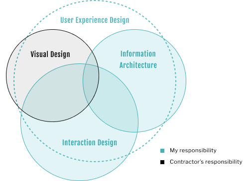
Visual Design
Before we get in to the story and structure of this powerful product’s user experience, let’s review the surface aesthetic. The “curb appeal,” if you will. Because presentation counts.
OFFSHORE CONTRACTOR
Before I arrived at Cleo in 2014, a look and feel for Cleo products had been defined by the UX Director in cooperation with an offshore contractor. I worked with this contractor remotely, for the duration of my tenure at Cleo. I did the IA and the IxD, and he did the Visual Design. Basically meaning I did the research, diagrams, prototypes, and wireframes. And he used my wires to generate comprehensive layouts.
was this the right AESTHETIC?
I will never apologize for being a passionate UX Designer. But it can occasionally put me in difficult positions ( a well-known risk of my profession ). In so many words, I thought the legacy aesthetic veered cartoonish and did not compare favorably to others in the market from similar, more established tech companies. And that not seizing this opportunity of a new offering to revisit the Visual Design would be an opportunity we would regret losing.

my appraisal of THE LEGACY AESTHETIC
Broadly, the legacy aesthetic just felt odd. For my money, it didn’t feel modern or like the kind of look the user would expect to encounter in this space. Which isn’t always a bad thing, but I felt the question begged asking.
The overall tonality bespeaks a bakery, or a toy store, or perhaps even a tanning salon. The liberal use of warm brown hues, studded with orange buttons, evokes Halloween chocolate and candy corn. The ubiquitous skin tones invite a number of other connotations, none of them indicative of business data.
The rest may sound a little nit-picky, but excellence in Visual Design requires attention to detail.
Too many font sizes. In the above view alone — which Cleo uses to PROMOTE their product — there are no fewer than FIVE font sizes shown. Generally, for such views, font sizes should not exceed four (per font face).
Deselected or disabled? Many Visual Design choices do not affect usability. But others do. When a user sees greyed text it can be interpreted as disabled. Too often the legacy approach used greyed text to signify something selectable — an obvious anti-pattern. See an example of that approach in the global nav (above).
An overall clumsiness in hierarchy, color, spacing, sizing, margin, and padding. The view above is emblematic of a vague inelegance I felt disrupted views across Cleo’s products. For example, look at the line of text just above the six charts. On ONE line, you’ve got two font sizes, a page title, and two tabs — one of them selected. And does orange signify selectable? Or selected? For the button, it’s the former, but for said tab, the latter.
So what was my big issue with this legacy aesthetic?
Well there were several, but let’s start with what I liked about it:
The sensibility it adhered to was consistently expressed across the suite of other Cleo products. The color scheme was certainly distinct. The iconography was consistent and descriptive. The font choice was straightforward. And the logo was engaging.
What follows are the PROBLEMS, as I saw them, in 2018 — and still notice as I write in 2025:
My Alternative
As you can see, the alternative I designed (below), evolved the look without supplanting it. By changing just one color in the palette, and re-deploying each color to group, separate, and signify, we arrive at a sharper, cleaner, more cohesive look and feel. The legacy font is the same but occurs in just two sizes. A contrasting font occurs in a discrete dismissable info banner. And THAT font occurs in only two sizes. Overall, a sleeker, more modern look with sharp new icons to match.

preference test
My alternative wasn’t perfection by any means. Looking back, some eight years on, I’m seeing a couple things I would change. But I was confident then — and am confident now — that it was far more suitable an aesthetic for the product.
Why? Because I have evidence.
Look and feel can be a tricky, tricky subject. If I had raised the issue with the Product Manager without any evidence, why would he consider it? Who was motivated to concede Cleo had been doing Visual Design wrong for almost four years? Certainly not the UX Director or his hand-picked contractor. Even if you got past the politics, it would just mean more developer time.
So to GET that evidence, I formulated a preference test and put my alternative up against the same view with the legacy look applied. And the 25 randomly-selected participants agreed by a four to five margin.
So why wasn’t my alternative used?
Product Managers often have a lot on their plate and this one was no exception. A lot was riding on this project. Had I been in his place I may have chosen similarly. In a politically charged environment, in which he enjoyed mainly nominal control over his product, he had far too little motivation or ability to rock the boat.
He graciously thanked me for my rigor and never brought it up again.
In retrospect, the headache his decision spared me was considerable: If the Product Manager HAD embraced my Visual Design, I would have had to:
Wrangle a new poltical position that might have put me at odds with both my manager and his contractor.
Make the case to that contractor that I was not trying to get him removed from the project — or from his contract.
Document my alternative for both the contractor and/or the development team, depending on how he reacted.
Lessons Learned
I like to think I become a better UX Designer every day. Looking back on this episode with seven years of perspective, I can say that mostly, I handled it in a way I can be proud of. I took it to the right decision-maker and didn’t embarass anyone in the process. If the Product Manager had decided he wanted to pursue it, I would have had his wishes as political air cover.
Some UX wisdom that was reaffirmed for me as a part of this short deviation from the rest of my work on this project was as follows:
While Visual Design is the most noticeable aspect of a product’s user experience, it is just a piece of a greater whole. The user’s ability to understand and start using a product is far less a function of its beauty as it is its structure and workflow. In spite of my critique, it has gone on to generate exceptional and long-lasting value in the marketplace.
The relationship between the Product Manager and the Product Designer is sacrosanct.
In all but the most design-centric environments, UX is 50% politics.

“UX teams of one sometimes have to be diplomatic, informed and well meaning meddlers.”
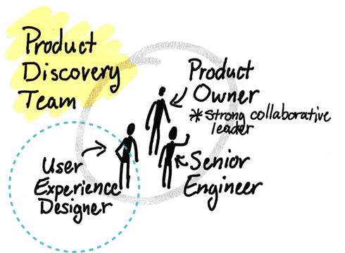
The Missing Piece: My Role at Cleo
I joined Cleo in 2014 as a Senior UX Designer. Back then, Cleo was far from the juggernaut it would become. Based near Rockford, Illinois, they had about a hundred employees. I worked with a few others out of a small satellite office in Chicago. I reported to the UX Director, a gentleman by the name of Mike Somoza, who lived and worked in San Francisco. I did not know it then, but I was about to gain some of the most important experience of my career.
information architecture & interaction Design
Cleo was full of highly intelligent leaders, business people, and technical people, who, respectively, were making smart decisions about the viability, the value, and the feasibility of Cleo products.
But who was conceptualizing the experience of these products for the end user?
With the help of his offshore contractor, Mike Somoza had put together a basic sensibility and aesthetic for Cleo products. But none were getting much traction in the market. This was in part because as an entrepeneur, Mike’s true passions were big ideas and compelling presentations. The meaning, importance, and relevance of both Interaction Design and Information Architecture were not on his radar. This meant execs were getting splashy PowerPoint presos full of ambitious ideas, but none were validated. And developers were working from these same decks, instead of mature wireframes.
In his defense, Mike came to appreciate the significance of what I was offering, even if he didn’t always understand it.

evangelism thru success
As widely-respected industry thought leaders like Jeff Patton and Marty Cagan have taught us, successful products arise out of the careful management of four separate, interlocking risks: Does it fit into our overall company stratgey? Can we sell it? Can we build it? And, can customers use it? It is an open secret in enterprise software that this fourth risk regularly gets short shrift. But why? And at what cost?
Over the course of three years at Cleo, and across three other products, I had worked hard to demonstrate the ROI of UX and had earned more trust with each new effort. In three and a half years, I had gone from tough conversations with the Technical Project Manager about small matters of Interaction Design, to collegial debates with executives about appropriate Conceptual Models.
For the completely new product, Cleo Integration Cloud, the stage was set for a fully-integrated UX effort.
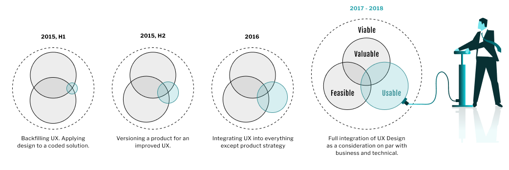
I worked on many projects during my time at Cleo, but the work I did on these three separate products best indicate the growth I spurred in its UX practice:
In 2015, I back-filled UX Design for a struggling mobile app project.
Later in 2015, I designed the next version of an enterprise file-sharing app for better adoption.
In 2016, I redesigned one of Cleo’s most critical offerings.

“The people most often responsible for creating our digital products rarely take into account the users’ goals, needs, or motivations.”
Process
A seat at the table, from start to finish
When this effort kicked off in 2017, I had not yet formalized the UX Design process I promote on this Web-site. But I HAD learned enough by then to insist on some table stakes as to optimal UX process for this project.
As I’ve described, one of them was ensuring UX was included in every conversation about this exciting new product from concept to code-complete. This was an imperative promoted in nearly every important book related to product design written since the aughts. Including one I was reading at the time, 'User Story Mapping' by Jeff Patton (O'Reilly, 2014), excerpted here (right).
To their immense credit, Cleo had already embraced Patton’s methodology of user story mapping before I had even joined. But his book on the subject had a lot more to say about PROCESS than the specifics of that one methodology. So I was able to get and keep that seat at the table, in part, by building on leadership’s respect for Patton and alluding to his view of UX as mission critical.
Lean UX
After a couple years of gently offering the more integrated, more collaborative approach Gothelf articulates, I had evolved everyone’s view of how UX work should happen.
By 2017, this evolution in process was poised to help ensure Cleo Integration Cloud would succeed.
Before he was the thought leader he is today, Jeff Gothelf was himself a designer. And his industry-shifting book, 'Lean UX' (O'Reilly, 2013) taught me how to design effectively in Cleo’s agile production environment.
And it helped me articulate two key problems in the way Cleo had traditionally pursued UX. The first was “BDUF,” short for “Big Design Up Front.” As I’ve described, Mike Somoza had been handing off big, unvalidated PowerPoint presentations to hapless developers who’d had little to no say in the design these decks described. BDUF happened as a result of the second problem, what Gothelf describes in his book as “Hero Design.” This is the impulse that leads one talented Visual Designer to believe he should go off by him or herself for a time, devise something dazzling, present it to powerful stakeholders, garner their overwhelming approval, and then use that momentum to leverage everyone else involved. If developers felt it was too difficult to implement in the allotted time, hard cheese. If the users ended up impressesed by the look, but bewildered by the workflows, that’s on them.
Bless him, Mike was an exceptionally smart and talented guy, but he was absolutely trying to be a design hero before I arrived. Can you blame him? This Hero Design model prevailed in so many quarters back then. And because Mike’s Visual Design chops were less than “heroic,” he unceasingly leveraged the talents of an offshore contractor adept at quickly turning around beautiful, high-fidelity comps for Mike’s PowerPoint presentations. To Mike’s credit and Cleo’s, they had collectively intuited there was something wrong with this hero approach. Which is why I was brought on.
After a couple years of gently offering the more integrated, more collaborative approach Gothelf articulates, I had evolved everyone’s view of how UX work should happen and had slowly expanded the circle of responsibility for excellence in UX to include everyone involved. From our developers, to our product people, to our charter customers. And by 2017, this evolution in process was poised to help ensure Cleo Integration Cloud would succeed.
Putting theory into practice
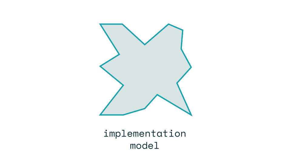
Everyone knows how to use a hammer. And most people could explain how it was constucted. I mean what’s to know? Attach handle A to the center of head B. Presto! This is a case where the “Mental Model” people have of a tool’s use cannot be compromised by the practicalities of its construction.
Obviously not. Such attempted negotiations between an implementation model and a desirable Mental Model are called “Representative Models.”
Unfortunately, a steering wheel on the floor is a lot of what happens in enterprise software, metaphorically speaking.
In his seminal book on Interaction Design, ‘About Face 4th Ed.’ (Wiley, 2014), Alan Cooper expertly describes all these distinctions and cautions designers to discover desirable Mental Models or re-use popular ones. And to then find ways of ensuring that what gets implemented facilitates this Mental Model, instead of the other way around.
When I started at Cleo, so much of Mike Somoza’s unvalidated BDUF would crumble at codetime. Often because they were never tested for feasibility.
Deprived of guidance and suddenly pressed for time, developers would implement desired functionality in a way easiest for them to code. Which rarely overlapped with a cohesive Mental Model, or an otherwise optimal user experience for our clients.
My dog-eared copy of Cooper’s book bore witness to every articulation I had made of the distinction between Implementation Models and Mental Models at Cleo. And to other cases I had to make, encompassing theory I had seen manifest in the wild at Cleo and in previous roles.
I would leverage these hard-won lessons to ensure the Mental Model of Cleo Integration Cloud was a good one. And that it was implemented with integrity.
But what about a car?
What if instead of a steering wheel, engineers directly attached a lever to each of the front wheels. The engineers say it will be a lot quicker to build the car this way.
Could you sell that car?
No, of course not. Because everyone’s “Mental Model” of a car’s operation includes turning a wheel. It doesn’t matter if it’s quicker to build it with levers.
But levers,” the engineers cry, “are so much closer to how the car’s steering actually works!”
Are you persuaded?
Unlike the hammer, this IS a case in which the mental model of a tool’s use can be compromised by the practicalities of its construction.
Same with software. Without mental models, the only people who could use computers would be coders who could write commands and execute them out of perhaps a DOS window. This was actually the case before User Interfaces. It was the truest example of an “Implementation Model,” in which your ability to use a tool depended inextricably on how well you understood how it works.
“Well,” say the engineers, “what if we connected the levers to a wheel on the floor? The driver could steer with their feet!”
Close enough?
Prototyping
The single most important innovation I brought to Cleo’s UX team and to this project, specifically, is the practice of testing ideas with clickable prototypes. There is no better way to get crossfunctional stakeholders out of their mental silos than sitting them down in front of an interactive simulation of a proposed solution. If shared understanding is the currency of Lean UX, as Gothelf proselytizes, then a prototype is Fort Knox.
But, as I’ve described, there was enough interest in new ideas for delivering successful products at Cleo when I joined to impel various stakeholders to seek out the wisdom of Product Management thought leader, Marty Cagan. And in both editions of his seminal book on the subject, Cagan highlights the true purpose and absolute necessity of prototyping. So, as I had with Patton, I was able to leverage leadership’s respect for Cagan to deflect any further hesitancy.
Plus, they just plain worked. And everyone saw it.
So, by the time work began in earnest on Cleo Integration Cloud, prototypes were an expected part of the process.
And, as we will see, they proved invaluable to the project’s success.
Were my clickable prototypes a welcome addition to Cleo’s UX practice?
Not at first.
Why? Because it was another disruption to the way the UX Director was used to working. For him, a design conversation ended when executive decision-makers gave their thumbs up to his PowerPoint decks. He didn’t want to hear about conversation STARTERS. To him this was like asking for trouble.
Worse, these prototypes would occasionally demonstrate that design ideas that had arisen from “Executive-Centered Design” were unusable, unwieldy, or too difficult to implement.

“The overarching purpose of any form of prototype is to learn something”
Ideation

Ideation represented fully 50% of my contribution for this effort.
Good ideas can come from anyone. But as a lifelong creative, I make it my business to first fully investigate a complex problem and then apply my imagination to the task of devising possible solutions. Good ideas get tested. One or two get prototyped. The best gets coded. This process requires humility, curiosity, and the ability to hold multiple opposing thoughts in your head at once.
If I am selling anything on this Web-site, it is my skill, judgment, and experience in understanding problems, imagining solutions, and visualizing them for stakeholder feedback.
Let’s look at just one example from this project …
2025:
Cleo promotes a core experience of Cleo Integration Cloud
Below, an excerpt from a video that appeared on the home page of cleo.com in 2025.
2017:
I design and validate this experience, some eight years previous
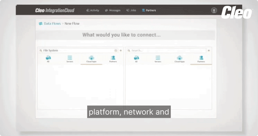
The trick here was getting to the heart of what we were proposing. Its essence. The technical conversations I was trying to keep up with between other, very technical stakeholders, kept coming back to the notion of data endpoints. And of connecting them, two at a time. Each endpoint would need to be configured and managed. What better way, I thought, to tell this story of duality for the user, than a kind of split-screen?
Below we see that idea evolve from sketch to production code.

That core experience of Cleo Integration Cloud started with this sketch I drew in the spring of 2017.

My next step was building this rough proof-of-concept prototype in Axure for key stakeholders to play with.

Using the feedback I got from the POC, I next built an immersive, ultra-functional Axure prototype, applying the "sketchiness" feature to ensure the stakeholders I tested it with never mistook it for production code.

Screenshot of this view in production in 2018. Learn more from Cleo themselves in their demo video.
There can be few things more professionally satisfying for a UX Designer than watching the spark of an idea you scratched into your sketchbook one night grow and evolve into the user experience at the heart of a major new offering: But among them is knowing that idea has persisted for fully seven years and helped your old employer achieve market success.

“Great design has strong, simple concepts at the core.”

Information Architecture
designing the core concepts
Certain things come to mind when most people think of the word ‘design’ as it relates to say, an airplane. Things like schematics, diagrams, and reports. But when these same people think of design as it relates to Web applications, they tend to think of it the way they do graphic art: Colors, fonts and splashy imagery.
But the reality is online business software has far more in common with airplanes than art. Sure, look-and-feel counts — as we’ve seen. But it is the structure and workflow of your enterprise application that must get the most design consideration if you are to achieve market fit for your product.
Indeed, look no further than the success of this very product for direct evidence of Visual Design’s subordinate role. As I demonstrated above, the look and feel of Cleo Integration Cloud suffered greatly by comparison to a more modern look. But it succeeded anyway because it was structured to promote understanding and adoption.
And this is the entire point of Information Architecture (IA). IA encompasses the design of a shared information environment’s overall structure to promote understanding and adoption.
Not to be confused with DATA architecture, IA is NOT technical. Some have compared it to chess in the sense that you don’t actually “see” the rules, but the game is meaningless without them.
And just as IA is often invisible, EVIDENCE of the countless critical design decisions that go into a product’s IA can be just as elusive: When a designer creates a mockup, everyone can plainly see the evidence of her work. But when she makes a design decision about how a system’s content model would best serve the user, the artifacts she’ll produce to capture that decision can be arcane and the evidence justifying it spread out over the course of the SDLC.
Again, as a discipline, Information Architecture can be elusive. And it had eluded everyone at Cleo until I arrived.
In part because, let’s face it, diagrams aren’t always exciting.
What IS exciting, however, is achieving market fit by empowering your users with a product that is more logically organized and easier to grasp than your competitor’s.
And a well-written IA spec is very exciting to the stakeholders who can appreciate them — like the developers coding your solution and the product manager who sees how it will drive business value.
Here we see excerpts (right) from just a few of the numerous IA documents I authored during the research, strategy, design, and implementation stages of the Cleo Integration Cloud project.
All of the IA work I did for this project drove discoverability for our personas, ensuring they could start using this product for its intended purpose on first login — without training and without help files. Because an effective enterprise product consistently educates the user as to its content model and reinforces it with every interaction.
I had a friendly relationship with the copywriter for Cleo’s training manuals. But he was always complaining I was trying to put him out of business.
Guilty as charged.
Interaction Design
Axure prototypes
If a picture is worth a thousand words, a prototype is worth a million. The work I did for the below enhancement is emblematic of the Interaction Design I delivered for the project overall. This highly-functional Axure prototype enabled every stakeholder to experience the enhancement it modeled before a single line of code was ever written. Including multiple key edge-cases.
follow-up wireframe
This is an excerpt from the followup wireframe of the enhancement shown prototyped in the above video. That wire is typical of the dozens I authored for this project.
Why have BOTH a prototype AND a wireframe? It was a close call for this feature, but generally, prototypes are questions, not answers. They’re intended to garner feedback so designers can evolve (or throw out) the design approach captured.
For developers, prototypes like the one shown above can be crucial for promoting CLARITY. But a rock-solid wireframe drives CERTAINTY by formalizing a finish line. Which is often especially necessary for offshore teams, when cultural and language barriers can be a factor.

“When the engineers are not co-located or when the product is especially complex — the prototype will likely need to be supplemented.”
Outcomes
company valuation
In the four years following the release of Cleo Integration Cloud, Cleo experienced an average rate of growth 40% higher than the previous four.
Awards
As of April 2022, Cleo has been named a Leader in EDI on the G2 Grid, a peer-to-peer review site, for 20 straight quarters. In Spring 2023, Cleo won 23 G2 awards — including EDI Leader Enterprise, MFT Leader Enterprise, On-Premise Data Integration Best Support Enterprise, and iPaaS High Performer Asia.
Transformation
In 2014, Cleo Communications had everything they needed to take their business to the next level — except an effective UX Designer. In three and a half years, by being that missing piece, I was able to mature their UX practice, set the stage for real product design, and deliver on a vision for Cleo Integration Cloud. An enduring product that has helped transform Cleo as a business.
UX Design I rendered for this project
The short version
In 2014, the little tech company with the funny name, had everything they needed to expand their market share in the EDI space — except an effective UX Designer. And after Cleo hired me that November, I spent two and a half years earning their trust, adding value, and otherwise setting the stage for the design of an entirely new product, Cleo Integration Cloud (CIC).
What was this product supposed to do? In the simplest terms, help industry-specific B2B computers talk to eachother.
And by the time planning on CIC started in 2017, I had positioned myself to discover and address every design challenge on the path to delivery. From its Conceptual Model, to its Information Architecture, to its Interaction Design and its Visual Design. In so doing I applied process that encompassed design theory from Cooper, Cagan and Gothelf. And proven methodologies for testing ideas, like clickable prototypes.
The single biggest challenge was ideation. How would we conceptualize all of this complex, industry-specific data exchange for our intended users? This is where I added the most value. In just one example of the analysis and imagination I applied to this effort, you can trace a view of core functionality Cleo still promotes in 2025 to a rough sketch I drew in 2017.
What were the biggest obstacles? Most were organizational. And mainly involved breaking Cleo of old design habits. By 2017 I had achieved enough momentum in this regard to replace lingering design ideas like “BDUF” and “Design Heroes” with Lean UX frameworks that encompassed shared understanding and crossfunctional design integration. But resistance to clickable prototypes persisted well into this project. And I never was able to dislodge Cleo’s attachment to what I demonstrated was a suboptimal product aesthetic. Evolving Cleo’s UX practice took evangelism, diplomacy, patience, and above all, demonstrable success.
The outcomes have been meteoric. Since the launch in 2018, Cleo Integration Cloud has risen to the number two spot in EDI market share, edging out competitors like IBM. And Cleo’s valuation has quadrupled.
Many talented, business, technical, and product people collectively share far more credit for the success of Cleo Integration Cloud than any one designer. But it was my distinct honor to be the missing piece that helped bring it all together.
Also — I should have bought more stock ;-)