usability remediation - 2015
When I rolled on at Cleo Communications in 2014, Unify & Trust was already in 1.0. By then, the market for file sharing solutions like DropBox and Box had exploded into the enterprise space and become ”Enterprise File Sync & Share” or “EFSS” for short. Unify & Trust was Cleo’s contender for EFSS market share.
So why wasn’t it selling?

Cleo’s Unify & Trust circa 2018. My job was to work within the EXISTING visual design to make this product more usable.
UX Design I rendered for this project
What about visual design?
Cleo had a PRE-ESTABLISHED look-and-feel to which all products were to adhere. I wasn’t a huge fan, but at least it was consistent. I worked with the contractor who had established this aesthetic to ensure there were no conflicts between his high-fi comps and my wireframes.
This duality can be confusing. How can the UX Designer not also be the UI Designer? Well, UX is not UI. UX encompasses UI. So having a separate Visual Designer is actually quite common. As Marty Cagan put it in the first edition of his highly-influential book, Inspired: How To Create Products Customers Love, “The disciplines of Interaction Design and Visual Design are very different.”
And the Interaction Design for this project, as captured in the wires I provided, represented just some of the work I did on this project, including strategy, research, and Information Architecture.
So like these others, the UI Design is just one piece of the UX Design.
Assessing the problem …
Generally, Unify & Trust was suffering badly, as many enterprise products do, from what’s been called “Executive Centered Design.” As opposed to, of course, User Centered Design. The UX team that preceded me had whipped up some glossy slideware, put it in front of the decision-makers, and had gotten the green light because it looked good. That team had then heaved it over the wall and expected developers to sort out all the details.
This had inevitably lead to poor usability. Unify & Trust would never stand a chance against the competition until we enabled users to intuit its conceptual model and discover its UI affordances. Here’s how I helped turn the tide.
Heuristic Evaluations
For an experienced UX professional, most of an application’s usability issues can be easily spotted in the performance of a “heuristic evaluation.” My initial heuristic evaluation got the ball rolling on a year-long series of validated UX enhancements.

Excerpt from my initial heuristic evaluation of Unify & Trust.
qualitative usability testing
I formulated qualitative usability tests and conducted them with live participants at workstations like this. For a less intrusive experience, I sat opposite the participant instead of to their side, watching their monitor mirrored on my laptop.

Workstation where I conducted several qualitative usability tests.
Solving usability problems by backfilling Interaction Design (IxD) …
but what is interaction design?
If Visual Design answers the question of how an interface should LOOK, Interaction Design answers the question of how an interface should BEHAVE. It answers the question of what happens when the user does this, or this, or this. As I mention in the above pie-chart sidebar, the look-and-feel of this application was not my responsibility. But how it behaved very much was.
Just as we’ve all had the experience of meeting a really attractive person who treats others badly, we’ve all had the experience of being utterly defeated by a beautiful application we thought would help us accomplish something (though we often incorrectly blame ourselves for the failure). And while I wasn’t among them, most stakeholders at Cleo thought this product’s UI was appealing enough in 2014. So why wasn’t Unify & Trust selling? Mainly because it was completely inscrutable. And it was completely inscrutable because while its fonts, colors and imagery had been designed, its interactions had not. Why had this happened? As Marty Cagan put it in the first edition of his seminal book on product design, ‘Inspired - How to Create Products People Love’ (SVG Press, 2008):
“The disciplines of interaction design and visual design are very different. To have a site that is both usable and appealing you need BOTH skills on your design team. Some teams are very lucky and they have a designer talented at both types of design. But in many cases, I think they just expect that since they hired a ‘designer,’ that person should be able to do both — and they can’t.”
When the distinction between Visual Design and Interaction Design becomes confusing, many turn to the latest TOOL for answers. At the time of this writing,
a plethora of prototyping tools available COMBINE the ability to specify Visual Design and Interaction Design. And in the hands of the single, unlikely talent described in Cagan’s quote (left), this can be a very positive development. But Interaction Design is more than a series of snap decisions squeezed between rounds of painting gorgeous screens. The need to present and compare workflow sequences conceptually and consider them in the context of the user’s goals is not something that can be addressed by any one tool, no matter how sophisticated. This is the hard work of the Interaction Designer — using the only truly indispensable tool there is: Design Thinking. The Interaction Designer must necessarily produce artifacts that capture the results of all this design thinking. And sometimes these artifacts are fancy prototypes. But just as often, they are plain old diagrams and specification documents.
“No," you’ll hear some say. “The whole concept of documentation is outdated! I read it in a blog!”
This just isn’t true. UX giant Alan Cooper still includes specification documents as core ingredients of the design process he prescribes in the most recent edition of his IxD bible, ‘About Face’ (Wiley, 2014). And no reasonable person would suggest that what Jeff Gothelf meant by getting out of the deliverables business was that all documents are invalid. He meant that FINISHED SOFTWARE was the POINT of UX Design — as opposed to “finished” documentation. Artifacts still play a crucial role in Gothelf’s vision of Lean UX. In short, artifacts may not be precious, but no industry leader has suggested they’re unnecessary. Think twice before deprecating specification documents in every form. Then think a third time.

Three sample Interaction Design issues I discovered and resolved …
sample issue 1: options should change based on selection
Unify, like many applications, enables you to select items from a list — in this case files or folders — and then do something to them. For example, you can select a file and then tell the system to move it or rename it. But if you select TWO files, renaming isn’t an option because files must be renamed one at a time. So, available options necessarily VARY based on what you’ve selected.
But when I first looked at Unify, I noticed the UI was not reflecting this dynamic. The operations available were signified by the bank of orange buttons in the upper right-hand corner of the main center panel. The only problem was that they never changed. The same three buttons persisted no matter what you selected. I was told the change in options happened inside a fly-out that appears when you click an ellipsis ( 3 dots ) icon next to the original three persistent buttons. This dynamic tied directly back to usability issues I discovered during testing.
Two things were broken here. First, the pre-existing dynamic failed to adequately advertise the nature of the relationship users had with their options as availed to them by the orange buttons. Or, in UX parlance, the “affordance” was not properly “signified.” Indeed, it did worse than fail to advertise the relationship: It actively obscured that relationship — burying it beneath some small, strange icon the meaning of which was unclear.
And second, it kept irrelevant options in context. The three persistent buttons invite the user to perform three distinct operations:
start a download
share the root folder
create a subfolder
(You can still see these three buttons in the below screen recording when no files or folders are selected).
The problem was that when the user selected ANYTHING, she was already indicating her desire to do NONE of those three things. For example, she’s not going to begin the process of sharing the root folder by selecting one of the files. So why would we keep showing her these three irrelevant options?

Looping screen recording of my solution. Options change as selection changes. This is the way it should work. But this is not the way I found it.
How I fixed this issue: In the above screen recording we see my solution, which was to of course better map the user’s controls to the state of available options. Specifically, my Interaction Design embraces the accepted pattern of dynamically updating the number and kind of action buttons that appear based on what the user has selected. And gets rid of the ellipsis icons. Just one of many IxD enhancements I made to this application that brought it into the realm of marketability.
sample issue 2: who brought this guy to the party?
Have you ever been invited to a party and then wondered if it was okay to invite a friend? If you were that friend, could YOU invite a friend? This is how I began a design-thinking session with key business and technical stakeholders to address a large hole in Unify’s UX. Filling this hole was a good example of the IxD I produced for this project. I wrote the below spec to first codify the existing logic around who had access to which shared folders and then to describe expanded logic to accommodate the new scenarios inspired by the design session. As well as all newly-needed UI behaviors.

Excerpt from Interaction Design Specification document I authored.
sample issue 3: whose file is it anyway?
Imagine a system like DropBox that enables you to create folders, fill them up with files and then share access to those folders with friends who can do the same. And now suppose this system offered you NO WAY of distinguishing between folders you created and those to which you’d been invited. The UX Designer that preceded me actually designed it this way on purpose, to promote a kind of ultimate communal experience. My IxD document specified subtle indicators that ended the confusion for less communally-minded users. Later I designed a means of enabling users to filter on this criteria.

Excerpt from the Interaction Design Specification document I authored.
Modeling desirable production outcomes with prototypes …
When core interactions are rife with dependencies, modeling them first is a must. Watch how this Axure prototype I designed and built compares to the production code. Then take the prototype for a spin yourself! I love it when a plan comes together.
Outcomes
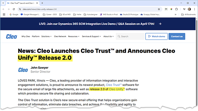
Press release announcing 2.0 release of Unify together with sister product, Trust
Better Product
I was the differentiator in this product’s success. Before I rolled on, Cleo’s Unify & Trust was a completely mystifying chunk of wasted effort. An inscrutable enigma of unrealized potential.
As a direct result of the steady, iterative, and sober UX Design I provided, it was transformed into an enterprise product that could hold its own in the EFSS space.
By the time I rolled off, it enjoyed an enthusiastic and devoted user base among a number of key Cleo customers.
Unify & Trust was still somewhat an ugly duckling and I would have preferred a chance to additionally update its look-and-feel in the manner I attempted for my last big project at Cleo.
Regardless, it was now a product Cleo could be proud of.

Unify & Trust as it stood when I left Cleo Communications in 2018
Better process
More than the victories of this specific project, the most important gain I made during this effort was evolving Cleo’s UX Design practice away from BDUF (Big Design Up-Front) and toward Lean UX.
I did this by:
evangelizing the distinction between the disciplines of Visual and Interaction Design.
bringing non-designers, especially developers, into the design process.
driving a more iterative, agile approach to each new design challenge.
This would set us up for success in my next two projects at Cleo.