Usability Remediation - 2015
When I joined Cleo Communications as Senior UX Designer in 2014, work was already well underway on this, the MOBILE VERSION of Cleo’s browser-based “on-premises” enterprise file-sharing application, Unify. Development and visual design had each been separately offshored to competent contractors, but the project was not materializing into a viable product. The front and back ends were not connecting to facilitate user goals. And potential customers were growing impatient. So what was going wrong?

Unify Mobile running on my Samsung Galaxy S5 in 2015, shortly after its release.
UX Design I rendered for this project
What about visual design?
Cleo had a PRE-ESTABLISHED look-and-feel to which all products were to adhere. I wasn’t a huge fan, but at least it was consistent. I worked with the contractor who had established this aesthetic to ensure there were no conflicts between his high-fi comps and my wireframes.
This duality can be confusing. How can the UX Designer not also be the UI Designer? Well, UX is not UI. UX encompasses UI. So having a separate Visual Designer is actually quite common. As Marty Cagan put it in the first edition of his highly-influential book, Inspired: How To Create Products Customers Love, “The disciplines of Interaction Design and Visual Design are very different.”
And the Interaction Design for this project, as captured in the wires I provided, represented just some of the work I did on this project, including strategy, research, and Information Architecture.
So like these others, the UI Design is just one piece of the UX Design.
My Assessment: too many skipped steps …
The root problem was not an uncommon one. Somebody had a provocative idea for a solution. Then someone else started designing mockups and throwing them at an outside firm that was trying to turn it all into functional software.
The design approach, the overall structure of the end product, and the particulars of its key interactions had all collectively been overlooked by everyone involved on a hard-charge toward code complete.
But what could be done at this late stage? We had clients waiting for this app and they were counting on our delivery date. My solution was to in three key ways “back-fill” missed steps while maintaining forward momentum.
Evangelize a better design process.
Back-fill missed steps in the Information Architecture Development Process by combining types of design deliverables.
Write the most economical and easily-consumable wireframes possible.
Evangelizing a better design process …
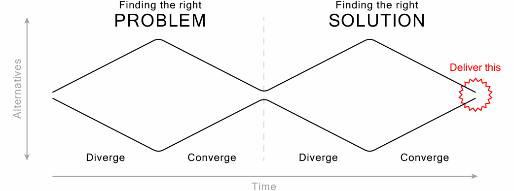
Diamonds are forever
What I brought to this project was pretty elementary stuff: The UX Designer that preceded me had lost track of the basics and had succumbed to a solution-based approach. Design Thinking requires just as much focus on the PROBLEM. Below we see this approach captured by the “Double Diamond Model of Design (slightly modified from the work of the British Design Council 2005).”
lean strategies
Time, as always, was a driving force in this project and we were running out of it. We had committed to a release date and our customers were counting on us to deliver. For one important customer, this product promised to address a key business need they specifically requested. We were all working as fast as we could, but some Cleo stakeholders were getting nervous.
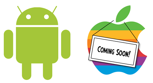
At some point during a particularly tense meeting I suggested we focus on delivering for one platform and hold off on the other to buy time.
The product manager realized that at no point had he committed specifically to delivering for both platforms and he approved this decision before we ended the call.
This is a core tenet of Lean UX Design. If you can’t deliver everything, deliver enough, backlog the rest and move on.
We followed on a few months after the 1.0 Android release with the iOS version.
Backfilling Information Architecture (IA) …
I assessed that not enough research or strategy had preceded design and implementation. Dev was in Scotland, making agile tricky and Lean UX impossible. So I back-filled research and strategy in the course of making specific change requests. Which meant, for example, my analysis reports would include recommended fixes. And my new content model would overlay my wireframes. For more on the importance I typically place on Information Architecture, review this project.
Two-for-one Heuristic Evaluations
This heuristic evaluation was typical of those I wrote for this project. It included specific, actionable change requests because implementation had commenced. There was no time to describe problems without suggesting solutions.

Excerpt from the heuristic evaluation I authored.
Two-for-one Wireframes
This wireframe was emblematic of the several I authored for this project. Typically content models and wireframes are two discrete steps. But here I save time by re-contextualizing existing views by overlaying a new content model.

Excerpt from a low-res wireframe I authored.

Backfilling Interaction Design (IxD) …
Once the overall structure of the app was settled, I produced high-res wireframes like this to hone each workflow.
Here I’m showing both “happy-path” scenarios and edge-cases in the same sequence of screens. Happy paths are called out with solid red lines and edge-cases with dashed red lines.
Combining content in this way made for short, economical documents that were quicker to write and quicker to read.

Excerpt from a high-res wireframe I authored.
Results …
As a result of the hard work I did on this project, backfilling both Information Architecture and Interaction Design, we met our release date and Unify Mobile went on to enjoy as much popularity with users as the desktop version. This is my portfolio, so it is obviously incumbent upon me to focus on my contributions, but I was merely the missing piece in a team of dedicated, thoughtful, and hard-working professionals.
No one team member can make or break a project of this scope all by themselves and it was my distinct honor to work alongside the kind of product people Cleo Communications is known for.
That said, the arc of this project underscores the fact that UX is not a consideration that can be handled by non-designers and cute graphics.
As Don Norman has so eloquently put it: “Engineers and businesspeople are trained to solve problems. Designers are trained to discover the REAL problems. A brilliant solution to the wrong problem can be worse than no solution at all: solve the correct problem.”
