projects - 2018
Product Design
You know you’ve done a good job for your employer when they’re boasting about the product you designed in a promotional video they’ve made available on their home-page. The most ambitious yet of their Cleo Integration Cloud suite of B2B products, Distributed Data Flows is a cloud-based SaaS Cleo launched in May of 2018. I architected every important aspect of this revolutionary new product's User Experience, from its overall content model to the core interactions on each of its key screens.

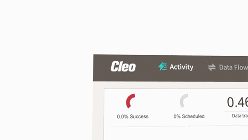
Screenshot from Cleo promo video highlighting this product.
Outtake from Cleo promo video highlighting this product.
UX Design I rendered for this project
What about visual design?
Cleo had a pre-established look-and-feel to which all new products and features had to adhere. I directed Cleo's Visual Designer and Interface Developers in applying that pre-established aesthetic to the sundry screens I spec'd in my wireframes.
I did design this alternative to a user interface we were using for a similar screen and ran a quantitative usability test to determine its comparative appeal. The test results proved users preferred my version by a margin of four to one.
For a number of strategic reasons, it was decided that the new aesthetic would have to wait till a 2.0 version. But because I left Cleo just before the 1.0 version debuted, all the screenshots shown here are of the 1.0 version — with the old look applied.
Emphasizing Process …
Above all else, this exciting new product is the result of the thoughtful application of process at every stage of its design. From my seat on a cross-functional “Discovery Team,” I evangelized “Lean UX,” successfully keeping this project on course and helping to evolve the design culture at Cleo away from “Implementation-Model design” and “Big Design Up Front.”
I also connected leadership’s high regard for thought leaders like Marty Cagan and Jeff Patton to the absolute necessity of more and better prototyping. The effect was immeasurable.
My prototypes did more to keep this project on schedule than any other single factor. Shared understanding was a constant and exactly zero developer time was wasted when one my prototypes was available.

Excerpted diagram from 'User Story Mapping' (O'Reilly, 2014)

Excerpted diagram from 'Lean UX' (O'Reilly, 2013)
Ideation …
There can be no more satisfying an experience for a UX Architect than watching the spark of an idea you scratched into your sketchbook one night grow and evolve into the user experience at the heart of a major new enterprise offering. Users of Distributed Data Flows access its core functionality on this, the Data Flow Details page.
In the below sequence of images, we see this view evolve from my 2017 sketch into a POC, then a prototype I used to validate it and then finally into the beating heart of the product’s experience. This was just the most critical instance of design thinking I both provided and elicited from fellow teammates.

The core experience of this enterprise product started with this sketch I drew in the spring of 2017.

Using the feedback I got from the POC, I next built an immersive, ultra-functional Axure prototype, applying the "sketchiness" feature to ensure the stakeholders I was testing it with never mistook it for production code.

My next step was building this rough proof-of-concept prototype in Axure for key stakeholders to play with.

Screenshot of this view in production.
Information Architecture (IA) …
Information Architecture (IA) encompasses the design of a shared information environment’s overall structure. Not to be confused with data architecture, IA is NOT technical. Some have compared it to chess in the sense that you don’t see the rules, but the game is meaningless without them. And just as IA is often invisible, evidence of the countless design decisions that go into a product’s IA can be just as elusive: When a Visual Designer creates a mockup, everyone can plainly see the evidence of his work. But when an Information Architect makes a design decision about how a system’s navigation would best serve the user, for example, the artifacts she’ll produce to capture that decision can be arcane and the evidence justifying it spread out over the course of the SDLC.
In short, it isn’t always exciting.
Here’s what IS exciting, however: dominating your market by empowering your users with a product that is more logically organized and easier to grasp than your competition’s. And a well-written IA Spec is very exciting to the stakeholders who can appreciate them — like the developers coding your solution and the product manager who sees how it will drive business value. Below are just a few excerpts from the numerous IA documents I authored during the research, strategy, design, and implementation stages of the Distributed Data Flows project.

This product’s final Content Model.

Excerpt from a sequential Service Blueprint.

Content Model for feature.

Excerpt from sequential Service Blueprint.

Excerpt from IA Specifications.

Excerpt from IA Specifications.
All of the IA work I did for this project drove discoverability for our personae, ensuring they could begin using this product for its intended purpose the moment they touched it. Without training and without help files. An effective enterprise product consistently educates the user as to its conceptual model and reinforces it with every interaction. I had a very friendly relationship with the gentleman who wrote Cleo’s training manuals but he was always complaining that I was trying to put him out of business.
Guilty as charged.
Interaction Design (IxD) …
The work I did for the particular enhancement described in these two artifacts is emblematic of the Interaction Design I delivered for this product overall. While prototypes like the one shown below are crucial for promoting CLARITY, a rock-solid followup wireframe drives CERTAINTY by formalizing a finish line for your developers. Especially necessary for offshore teams.
This highly-functional Axure prototype enabled every stakeholder to experience the enhancement it modeled before a single line of code was written. Including multiple key edge-cases.
This is an excerpt from the followup wireframe of the enhancement shown prototyped in the video. The wireframe is typical of the dozens I authored for this project.

Visual Design …
When I rolled on at Cleo Communications in 2014, their Director of UX was in the middle of an ongoing effort to unify all of Cleo’s wide-ranging products under one all-encompassing look-and-feel and had engaged an offshore Visual Designer to do this.
So what was my job? Every other aspect of UX Design: Information Architecture. Interaction Design. Usability Testing. Prototypes. Wireframes. Coordination. You name it. But the look-and-feel of Cleo’s products would remain the domain of this offshore visual designer.

Update to established aesthetic: Test results proved users preferred this update to Cleo’s established look-and-feel. By a margin of four to one!
reason for this update
Unfortunately, as years passed and the unification effort wore on, this designer’s initial vision was starting to show its age and he knew it.
So in 2017, just after I’d devised the overall structure of this new product, I sat down and created this mockup, and by implication, a much-needed update to Cleo’s overall aesthetic. And when quantitative usability test results confirmed its appeal, I presented these results to my fellow members of the cross-functional leadership team.
Why wasn’t it used?
For a number of strategic reasons, it was decided that this new aesthetic would have to wait till a 2.0 version. I would continue to direct our visual designer in the application of his aesthetic to my wireframes.
Which is why all the screenshots I show from the actual production version of this application differ in both look and feel.